Who’s up for another house plan review?

Last time someone posted a house design, people seemed to enjoy critiquing it. If you enjoy doing that, here is another chance. If not, please ignore this thread.
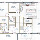
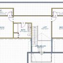
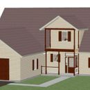
I created this house plan with my in-laws in mind. We are trying to convince them to move closer to us near Flint, Michigan. If we can find a nice lakefront lot to build on and a good design, we might have a chance. They are retired. Stairs are not currently a problem for them, but the house is designed so that they wouldn’t need to go to the second floor.
GBA Detail Library
A collection of one thousand construction details organized by climate and house part



Replies
Reid,
What direction does the front of house face?
This looks like a CPHC test. You scored an easy 10 points for putting the retirees' master bedroom on the first floor.
Reid,
At first glance it is a nice, functional floor plan that I'm sure they would enjoy living in. The two things that fit uncomfortably into the whole are:
- The front entrance. I understand what you are trying to do, but it is unresolved as it is right now. From the inside the double-height space faces a blank wall with a very small window situated sort of in the middle of no-where. On exterior I'm not sure what is going on. A porch with no floor at the second level? None of the elements, especially the columns, has enough presence. They need to be detailed in some style, Craftsman, Neo-Classical, whatever, but the house needs to take on some personality.
- The garage. Having the garage door dominate the front facade is something developers do because of the constraints of narrow tract lots, not on a lake front. I would either detach the garage, or at the least link it with an enclosed, conditioned breezeway, and move the doors to the wall next to the entrance, so it created an entry courtyard.
You might find this useful. Just disregard the title, there is some good advice:
http://www.mcmansionhell.com
Maybe a couple of dormers instead of one. Or none on the non lake side. While I don't like pulling up to a house and seeing mostly garage, I expect you will find that most lake lots are narrow.
Reid,
Like Malcolm, I was struck by the "garage-forward" design -- not the most attractive way to integrate a garage.
Until you buy the lot, it's hard to design a generic plan. Your ultimate plan will be changed once you know important facts:
1. Which way is south?
2. Where's the driveway?
3. Where's the street?
4. Where's the view?
A cape like this will have all of the air-sealing problems (and problems associated with a convoluted thermal envelope shape) that every cape has -- I favor one-story designs or two-story designs over 1 1/2 story designs for that reason.
You've got two doors -- one from the garage, and one from the main entry porch. Neither door enters the house in a functional or inspiring location. With either door, you're faced with a hallway or a walk to get to a room that you probably want to reach.
Thanks for the input.
The front entrance was a trouble spot as this design came together. What worked best on the inside put the front door in a location that didn't look good on the outside. This was the best compromise I could find after experimenting with a few concepts that came out especially poorly on one side or the other. I haven't put much effort into getting columns right.
My in-laws have a huge detached garage now (24x60). I figure they would likely need a separate detached garage unless they are willing to get rid of a few boats or pay for off-site storage. However, they currently miss being able to get to their cars without going outdoors. I hadn't considered a breezeway. That could open up some good possibilities.
Thanks for the McMansion reference, Malcolm. I took a quick look and it does look like there is good information there. I will spend more time at that site when I am not late leaving for my paying job.
Martin, I agree that there are many criteria that are impossible to evaluate without lot information. Once a particular lot is under consideration, I would have to evaluate whether the plan could be tweaked or if a new plan was needed. For our own house, I did a whole new plan after we picked the lot. However, the process of creating some generic plans and discussing them helped clarify what was important to us and what general layouts worked well.
@Malcolm Taylor
One of the best websites ever! Thx for the laugh.
Reid. Have you considered working with someone like Ted Benson at Bensonwood Homes (http://bensonwood.com/). Based on your floorplan, it looks like they build the type of home your in-laws would find attractive. One of the things I like about Benson's homes is the attention to detail and science-based building practices and focus on creating assemblies that allow the structure to evolve over time. (Plus, the company is into Universal Design, which is important when creating a retirement home.)
Perhaps the biggest advantage would be a simple build process from a team that is intent on quality. I've site built two houses and will never go down that road again. (My measly $250 square foot budget is not sufficient to buy quality in my market apparently.) My next place will definitely arrive as a flat pack from someone like Benson or EcoCore. (BTW. I have no connection or vested interest in Benson's company. You also might want to check out EcoCore. Benson just seems like a good option for someone who has the budget to afford a quality product.)
The entry design reminds me of two things.
1) At first glance it looks like scaffolding set up in front of the entrance, something that I have had at my house far too long while the crew that set it up is working on other parts of the building. It's also something I see set up in the winter in front of public buildings designed by architects who didn't think about where the snow and ice would fall relative to the public entrance. Neither of those associations is positive for me.
2) It reminds me of the front entrance designs I sketched for my own retrofit before we got professional help with the design. The aesthetic improvement between my sketches and the professional design is amazing.
I agree with the comments about the garage being too prominent if the view from the front. There's one house in our neighborhood with that configuration and it is the ugliest and least friendly looking house by a long shot, although there are other reasons that particular design doesn't work well. The breezeway approach, in addition to giving you some more design flexibility, is also more sure to prevent air quality impacts in the house and is also a fire safety improvement.
I like the fact that you've got the plumbing mostly in one end of the house.
I understand Martin's doubts about where the entries come in, but I do some logic to the dual foyer aspect--one for residents' messy piles of outerwear and boots, and one kept clean for guests to enter. And the guest entry leading to the living room makes sense. The entry location from the garage doesn't seem as good, but maybe that will change with a reconfiguration of the garage.
There are lots of other things to think about that are site specific.
There is some unused space under the stairs that may be used for the pantry that would allow a little more space to be added to the living area. When entering the master bath your first view is of the toilet, you might try flip flopping the toilet and linen closet to block the toilet upon entering the area. The laundry sink will be tight with door - you could probably remove that door to the laundry area. If you are concerned about noise, you can always add a door in the hallway area to the main hallway - this will serve as an air lock to the main part of the house. The 3 run of cabinets in the kitchen all have different end points, seems like there could be a common end point.
Reid. If you want more inspiration for your design, consider check out the residential section at Arch Daily. The site features curated designs from around the world. http://www.archdaily.com/search/projects/categories/houses/country/united-states
Matt, If I use a slab on grade foundation, I am hoping to use the space under the stairs as a utility closet. If I convert to a basement foundation, that space is needed for the stairs to the basement.
We built our house and have a very similar 2nd floor layout. We made a couple changes to our design that worked out very well for us. The first is the bedroom closets. We put in a 50" wide "nook" in the middle in each room to create two separate closets 4'-5' wide closets. It makes the room look so much larger and functional. You could put a desk or armoire in there or a little "lounging" area. Plus there is still plenty of closet space left.
In the 2nd floor bathroom, we have shower where the vanity is (that creates a little walled off area for the toilet instead of the toilet being next to the vanity) and the vanity and little closet switched. We also could fit in a double vanity which was huge.
Recommend a double vanity in your master bath too. There is little extra expense and really adds to the functional and resale later on down the road. Good luck with your plans!
There's a lot to like here, but the front entrance stands out to me too. The front door opens into a view of a closet, not a room. You want there to be a straight walk into the house with not needing to turn at all. The whole entry room also seems very small and confined. I think you could solve all these problems by putting a hallway between the entry room and the kitchen, and rearranging some things so that you can walk straight from the front door into the kitchen. I've attached an extremely crude mockup.
I am attaching another iteration. The goal of this iteration is to see how much I could improve on the exterior aesthetics without radically changing the floorplan concept. I am not ignoring the advice to move the garage or move away from 1 1/2 story. Future iterations will explore those directions.
I did make a few changes to the floorplan. I moved the stairway and pantry over, eliminating a hallway and merging the two entryways into one. That allowed me to move the right end wall inward while maintaining the family room area.
Reid,
I think you are close enough. The plan will need to be modified extensively to fit whatever site they choose, so there isn't a lot of point fine-tuning beyond where you have got to for now.
Without processional help you can very likely make these changes and have a floor plan you like. I would urge you to then take it to an architect or designer for some quick sketches to fine-tune the exterior. Right now it looks like a generic house you might find in a subdivision anywhere in North America.
Architecturally, it's still kind of a mess. Massing priorities, voids, spatial organization, etc aren't really coherent. Shutters that don't fit the windows? BIG no-no. But that's what you usually get with kit-of-parts design software, and it's not like that's stopped many homeowners and builders from spending a lot of money on things that could pretty easily be a lot better.
http://www.mcmansionhell.com/post/148605513816/mcmansions-101-what-makes-a-mcmansion-bad
Like others have said, you're going about this the wrong way. Find a site first, and that will inform what comes next. I'd highly suggest hiring a decent architect.