Design Details for Stair and Ceiling
Switchback stair design + Vaulted ceiling
Got the final set of plans back from the designer and they look pretty good – he implemented everything we wanted including lots of the constructive feedback received here on GBA – thank you!
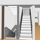
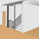
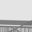
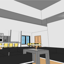
There are two details, however, that upon seeing them in 3d look totally wonky – the switchback stairs and the vaulted ceiling in the living space.
For context, we had asked him to drop down the vaulted ceiling over the great room from its original full height to 15 feet to make it easier to light the space. I assumed he would ‘drop’ it one way, and he did it a different way that ends up looking really weird. Not sure if we should have him adjust the drop line to keep a lower ceiling height in a more attractive manner, or if we should restore the full vaulted height because of how it connects to the stairs.
The original stairs were not switchback, and there was a wall separating the stairs from the great room. The stairs now seem like they should be open to the great room, and to do that well might require a full-height vaulted ceiling. Also think we should add a door to the stairs going down to the basement and block those off.
Appreciate your thoughts on this! And don’t mind the low-quality render, or the fact that for some reason the stairs have rails on both sides going up and down despite being entirely enclosed. Have a call w/ the builder today because I know he’s built switchback stairs that look good; just frustrated with the lack of actual design sense from the designer.
GBA Detail Library
A collection of one thousand construction details organized by climate and house part



Replies
Posting to add two more pics of vaulted ceiling due to attachment count limits.
I dont really understand the living room ceiling... Is if vaulted all the way up or does it flatten at like 4' above kitchen?
If the latter I think it looks a bit weird. Rather than have a plane change in the ceiling, if you are trying to keep it lower, you should just build another ceiling at a lower pitch to achieve the overall height.
If you had a full vaulted ceiling in the living room I think the kitchen dropped ceiling would probably look fine. One way you could define it a bit more is a material change, perhaps a wood ceiling in one room or another.
For the stairs you can open them to the first floor without opening them the entire way up and it will look fine. Just remove the wall where the railing is up to that second floor.
I think one reason you are finding much of this stuff looks funny is that the detailing in the renders, for instance the gray substance. We unconsciously pick up stuff like that even if we know it wont be there in the future and it makes everything look off. Materials change spaces substantially and its hard for us to overlook them.
I think we're going to go back to the full vaulted ceiling in the great room, open the up staircase, and make sure the railings are high enough that the kids aren't tossing themselves down the stairs accidentally.
The 3d models definitely look wonky due to the textures, that's a good point to remember. Also appreciate the idea about different ceiling material over the kitchen!
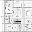
First, for what it is worth - I think you have a beautiful in-progress floor plan :)
It is a bit hard to understand the ceiling without seeing the entire home... I assume there is a flat ceiling over the kitchen because of 2nd floor living space above, correct? But why is the living room vaulted ceiling flat, attic space but you just really wanted it raised?
I am confused about the north (?) wall of the stairs on L2 - is that structural?
In my non-expert opinion I would definitely open up the north side of the stairs, this looks similar to the stairs we are about to build. However with no vaulted ceiling, our primary suite is above the living room so we can only open one level of the stairs. This looks awkward with railing at the landing, so we are doing angled slatted wood (I can share if you want to see an example). We also have a drywall divider between the stairs so there are no posts which looks cleaner and saves a bit of $. Depending on your style preferences and budget, you can do a really nice feature here whether it’s posts or glass or drywall with wood cap on top like we’re doing. But regardless I think it would look great opened up. And yes you could close off the basement stairs if you see a benefit.
You might be really surprised to see how different your design looks in a photorealistic version, especially with your surrounding views out the window, compared to how it looks on paper or the awkward glitchy 3D model images. So yes parts like the grey stuff looks weird but don’t get be worried if you’re not looking at proper beautiful renderings.
Also, this is unsolicited but I might consider putting full height pantry cabinet in place of the bar area… you could put a bar/cabinet under the window just beside the dining table! But I don’t know your needs, I just know there is never enough full height storage to hide stuff in kitchens.
I would have posted all the floors, but god willing this is the last floor plan post on GBA from me so I left the basement and 2FL out : )
You're right in thinking the 2nd floor above the great room is empty space - there's no room there. Originally had it vaulted to the roofline, we asked him to drop it down to 15 feet to make it easier to light the room well, and he dropped it in a weird fashion.
Agree with you and freyr that we should open the stairscase to the great room - that's what we thought he was going to have it look like anyhow.
My designer was good enough to send me the CAD files throughout this process, and I too taught myself a bit about how to use it, to the point where I was mocking up changes for him and sending them back for him to build on. The screenshots here aren't actually just renders he provided - they're shots I took myself from the full 3d model of the house. I thought AutoCAD was cool...until he showed me Revit. I didn't realize he was modeling in 3d the entire time! It's pretty powerful to be able to 'walk' through the entire model of the house!
Also the entire kitchen cabinetry layout is TBD - we're meeting with someone next week to make selections. The bar area is definitely not going to eat up space like that! Thank you for your feedback!
Our architect would not share the CAD files, that’s great that you have yours! Sadly I can’t use Revit as an Apple-person. However I highly recommend checking out Homestyler - they have a free web-based program (made by the same company, Autodesk). It’s AI powered and suuuper easy to use. It is very basic but you can easily do custom modelling if you want to add anything you can’t do with the built-in features.
Honestly I checked and saw your past post with so much great advice from people on this forum, you are lucky! It made me a bit sad that I didn’t do the same, I was told not to even do sketches of ideas during our design process :( and was told not to share online or get feedback from others. I am really disappointed with our floor plan and the design experience but now we are mid-construction, interior framing is done so it is what it is.
Just curious, how many sq ft is your place? It seems like you’re getting a lot of functionality from the space. We have over 3,400 sq ft interior and it’s mostly hallway and circulation space…
When it comes to finessing the remaining details, I say take your sweet time and don’t let anyone pressure you into accepting things you’re not sure about! Once construction starts, it moves fast and being 100% happy with the plans and all details prior to starting work on site seems important. I knew our plans weren’t great, but wasn’t about to start over or pay even more design fees so we just had to accept it for what it is after 6 figure design.
Erm, back to your ceiling — if you have space to work with above you should definitely ask the designer if there are other options for dropping it. I don’t know that I’d do all this for easier lighting. Guess it depends on your plans there, but lighting is overrated in a living room. Even with a really high vaulted ceiling, there are lots of options. You also have lots of wall space, get some sconces 😉
I agree with your suggestion of full height cabinets instead of bar. A six figure design fee and you aren't happy, holy crap! I note from some of your other Q&A that your architect seemed to be designing more for her portfolio rather than what your needs are. We made it very clear to both our architectural and interior designers during the process that this house is to live in, not for instagram. Function over form. Can try to make it look nice once we have function. Zero overhangs are a huge trend here as well. I said, no way, make the overhangs bigger...lol
Let’s just say satisfaction was not guaranteed.
The stairs should open to the great room. What's in the basement? If it's additional living space then there shouldn't be a wall between the upper and lower stair sections either.
I can't comment on ceiling designs without seeing a section.
I will admit, I'm surprised to see the powder room opening onto the front foyer. It's a bad location. No guest will ever feel comfortable using a powder room that opens onto a main living space. Imagine them excusing themselves from the party and going in there to use the room and when they come out everyone is looking at them. It's even worse when other guests are seated at the dining room table.
I would strongly suggest switching the front hall closet with the powder room and having the powder room accessed from the mudroom. It will get far more use from your family members coming in from the backyard and garage than it ever will from a guest and it will give everyone using the powder room a lot more privacy as well.
David,
These look much better than the first version and It's good that you and your family are happy with it. Switchback stairs are very functional and compact, I have them in my design. As I said in your first floor plan, I would make a few personal tweaks, but it's more important that it fits your needs. I think the powder room is fine where it is.
Question on the LVL beams. It looks like they have designed it so you won't have any posts in the open kitchen and dining area. If you open up the stairs, which I think is a great suggestion, looks like a post is needed to support the lvl at the stairs. The flush LVL looks like it rests on the headers for the swing door?
Is that a sliding door next to the swing door? If so, I think you may find you rarely will use the slider as is easier to use a swing door. You may want to consider eliminating the swing door and make the slider bigger. It would be a much bigger architectural statement in your house. With a 14' ceiling height, putting a transom above the slider would look great, but its easy for me to spend other people's money.
"Have a call w/ the builder today because I know he’s built switchback stairs that look good; just frustrated with the lack of actual design sense from the designer."
It's unfortunate that you have to deal with either an inexperienced designer or one that doesn't have the design sense to meet your needs. You are making up for it with your own input and feedback from GBA and you are making the best of it. That's why I always advocate to be very selective when picking an architect/designer and don't look to save costs in the design phase.
Ahh this is what I was thinking and forgot to mention - the stair beam! I assumed there is one there for support, which will make it a bit awkward to open up the stairs. In our case we did a custom slatted wood design to deal with this but basically having a regular railing and posts going up the stairs gets awkward at the landing where a 36”H guardrail will have a small gap above it before the LVL beam…
I think it could still work with one post at the corner of the stairs and railings. The corner where the stairs start would need balusters there or just a small triangle wall to railing height. I would for sure ditch the wall between the switchback and open that up with just railing.
As others have said, it will look much better with the wall removed and the stair open.
The dropped ceiling also looks a bit goofy, I would get rid of it. Many ways of lighting the place with tall ceiling, up-lights hidden behind crown and light fixtures with extra long drops are a good option. Pot lights are also pretty simple but not the most flattering light.
As for support, the stair guys can make the stair and landing in one piece. Think of a hockey stick shape. The lower section plus half the landing is one piece, the upper section plus the other half of the landing the other piece. This way you only need the support at the back wall and no need for any posts so the stair will be mostly floating.
There are many ways of skinning the upper floor support structure around the living room that can leave the stair area fully open.
Thank you all for the feedback! Consensus seems to be having the stairs entirely opened up to the living room and that we should keep the ceiling fully vaulted in the great room. Do we open up the stairs down to the basement as well? I think it's basically floating stairs at that point, correct?
Do you mean opening the wall under the stairs going up to level 2, on the living room side? Not sure what the basement layout is, if it’s open rec space below that could be fun. I don’t have kids yet but there is something to be said for sending them down to cause chaos in a basement play room and have it quieter on the main floor.
If that is what you mean, opening basement stairwell to your great room, it might come down to cost and I don’t know much but I know enough to know that it will be expensive. I’d personally just leave the basement stair open without a door but would probably cover the side with solid wall on the bottom portion and leave it open above the stairs, ideally you can get rid of the beam there so it can be really open. Maybe you could do an interesting built-in against the stairs here with a little bar area.