Suggestions for house plans
Hello again,
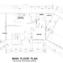
Moving on from the great heating advice that we recieved a while back from you guys on here, we’re carrying on with the design of our new home. We’re still working on a few details of the home plans. We have the shape of the house ironed down but may have to come back to rearrange some partitions inside.
I’ve spent the last while going through a lot of the articles and discussions on GBA. Some aspects of the house I now feel good about, and they been positively reinforced with the opinions on here.
There’s still a few things to iron out but i thought it’s best to post the drawings at this point and see if you guys had any further suggestions. The more opinions i receive before heading back to the draftsman, the better.
As of now, the walls be constructed 1/2″ gyprock, 6mil poly, 2×6 studs with R24 Fiberglass Batts, 1/2 ply, 2″ Roxul comfortboard, Tyvek, and Vinyl Siding. We’re still going though all of the estimates so there may still be a few dollars left to beef up the envelope.
We laid out the house to suit the plot of land that we’re on. The living room is offset 30 degrees from the main structure because the view is in that direction. Unfortunately that’s pointing north as well. Theres lots of big windows on the west side of the home as well. I’m well aware that its not ideal. I’ve kept lots of trees around the property though so that it will be shaded late in the evening.
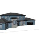
I’ve adjusted all of the window sizes from the original drawing. The 3D image sort of represents what the house would look like with the changes. Still a few windows to make smaller though or eliminate altogether.
It’s been a challenge trying to keep the house suited to the plot and to incorporate everything we wanted in the layout. The draftsman didn’t have much interest in the style of the house or efficiencies so I would be kicking myself I think if I didn’t post the plans on here for you guys to have a look. Any advice would be greatly appreciated.
Thanks
Daniel
GBA Detail Library
A collection of one thousand construction details organized by climate and house part



Replies
Daniel: Where will the house be located?
Why are the garage and the room on the left set at an angle to the main structure?
I'd be concerned that the bumpouts in the front will be hard to airseal and insulate.
Forgive me if this is intrusive, but is budget much of a concern? All those angles, roofs and corners will be expendive to build. Most folks around here would put their money into a better envelope and a simpler design.
Most people will suggest that you skip the poly.
1. Closet in entrance from garage
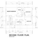
2. Much bigger bathroom upstairs (it's TINY). Steal some space from the bedroom to reconfigure the bathroom.
Probably more, but that is what jumped out at me right away.
Daniel,
I think you have come up with a serviceable floor plan for a house you will be happy to live in. I'll just make a few general comments around practicality and aesthetics.
Part of a design process is seeing how the plans practically support the activities you will be doing in the house. When I look at your plans, the three activities that don't look that well supported are: the laundry, accessing the outdoors, and the wood heat.
I understand the convenience of having a laundry on the second floor, but I'd look into enlarging it, even if that only meant deepening the closet so that baskets could sit in front of the machines, and all the activity didn't take place in the hall at the top of the stairs.
One of the joys of large lots is the relationship of the house to its surroundings. Not only views, which you have addressed, but access as well. Try thinking through your path to the most desirable part of the garden, to the barbecue, Is it well served by the location and number of doors? Where do you end up once outside? Is there a sheltered porch or some other welcoming feature?
The wood stove is situated an great spot both from an energy and aesthetic perspective. What could perhaps do with some more consideration is how you will supply it with firewood, and where it will be stored. Even the most meticulous users leave a messy path.
Finally, if you look at the exteriors of the projects featured here on GBA, I'll bet you can distinguish which ones had the advice of an architect or designer, and which are drawn by their owners. This is of course a generalization and there are lots of exceptions but, practical considerations aside, you want to end up with something that looks interesting and beautiful. Thats a skill that isn't easy to acquire, and might be worth paying someone for.
Daniel,
You've received good advice. Malcolm's right about firewood storage. I designed an indoor firewood box near my stove. The box is against an exterior insulated wall; the exterior side of the firewood box faces an unheated mudroom. The back of the firewood box has an insulated, gasketed door that allows me to load the firewood box from the mudroom. The mudroom has a door leading directly to the attached wood shed. Firewood goes from the woodshed into the firewood box without anyone having to walk through the house with an armload of wood.
I agree with Stephen about the bumpouts and the weird angles. These angles and bumpouts make the roof complicated to frame. Expecially, the two bumpouts on the front of the house are disturbing to me -- why not pull the rectangle outwards, integrating these two bumpouts into a simple plan with a straight line across the front elevation?
Hello,
This is good advice and is exactly along the lines of what i was looking for. Better to hear it now rather than when the drywall is being installed.
Stephen, There is a budget of course and we're within it just now even with the funny angles and bump outs. The bumpout on the left just pushes the stairs out of the house to create a little bit of extra room. The one on the right was just to balance the look of it. I've tried it again in sketchup it with the right bumpout brought back into the house and the garage now straight with the main structure and it still looks good. It moves the utility room and bathroom on the main floor further into the house but that's a better use of the space.
Malcom,
I agree with you totally about the laundry. It looks like it got crammed in there for the convenience of having it on the main floor because it did. I sort of put my foot down in terms of making the dimensions of the house bigger and thats where it ended up to. I see what your saying for access to the rest of the lot as well. Most of the land is behind the garage so if I straighten that end of the house out it would help with that issue as well.
We tried to create a bit of a covered porch between the two bumpouts. That was the only reason for the step-out on the right.
And your right again that the house was self drawn. I think I will sit down with an arcitect or designer and see if this is a good design to keep pursuing or if we should start again.
The idea of the wood box is great. I think that's really clever. That would be easy enough to install as well, either through the garage or just off the kitchen. An extra door is the only real expense there so i'm sure we can work that in.
Do you plan on having gutters? I live in a region where gutters are not very common, and it seems that most houses that have an upper roof dripping onto a lower roof have water damage on the siding from the splatter when the rain hits the lower roof. Given that gutters are frozen for a good fraction of the year here (which is why they aren't common), I'm not sure it would be much better with gutters. But in a climate where gutters work better it might be fine. Also, I imagine vinyl siding can hold up to that pretty well, but I'd still give it some thought.
As a homeowner who first started sketching designs and making cardboard models myself before employing a design professional, I agree with Malcolm's final paragraph. There was a world of difference when we got some professional help. And the help was not only aesthetic--it also included experienced guidance on construction costs that probably saved us more money than we spent on design services. Your design looks better than mine did, so you've got some skills that I don't, but it doesn't look as good as our final design does.
The usual green building advice on garages is to detach them or attach them only with a breezeway, so that garage fumes don't impact indoor air quality. Even if you achieve a low-leakage envelope, whatever small leakage you have between the house and the garage tends to bring garage air into the house in winter, and if the air changes in the garage are low, the concentration of fumes in the garage can be worse than in leaky construction, so the amount brought into the house could still impact the air quality. There are solutions, such as a very small exhaust fan in the garage, but passive solutions have a lot of advantages over active solutions like that.
Charlie,
Yes we'd have gutters installed right around the home. They do freeze up but the don't cause much trouble. The do more good than bad I guess. Good point though about the water stains on the siding and the roof.
I'm not against taking the garage off the house either. I was planning on building a separate workshop on the property but I could put the garage and workshop off in the one building now and just partition off the garage area. The breezeway would have to be good and sheltered is all. Good idea.
I didn't think the design looked to bad either, thanks, but i'm still not sure if its the way forward. This is the second house that we'll be building now (hopefully the last). I'm going to bring the design to a professional though and try to improve on it or even start fresh.
Daniel,
Don't abandon your plans, they only need tweaking. The exterior, with or without the angles, just needs to be looked at by someone with a good sense of proportion.
Good luck with your build!
Charlie,
After smelling solvent fumes in her townhouse, my mother-in-law and a cohort of maintenance workers spent much of the weekend trying to track down the source. It turned out to be a small leak in her car's gas tank. Interestingly, the fumes were also noticeable in her neighbour's units on both sides.
Thanks for the advice. I'm going to try to get them to work Malcom. Finding a balance between the style and esthetics of the house, making it easy to construct and trying to incorporate greener features is difficult. No two ways about it.
Daniel, which direction does the street run? Aesthetics from that direction are more important than from other directions.
Do you feel constrained to 24' depth? If the best view is off to the side, a deeper but narrower footprint may allow more rooms to have a view in that direction.
When you have bends in the building, you end up with rooms that are non-rectangular. With these rooms, you have to pay more attention than usual to evaluating whether there is at least one logical way to arrange the furniture. If you are using software that has a library of furniture, try using it. If not, you can do it the old fashioned way of cutting out little pieces of cardboard to scale. My home has a single 45 degree bend in the middle. I ended up with non-rectangular kitchen and dining room. Any changes to the non-rectangular rooms seemed to cascade more than for rectangular rooms making it harder to refine the design.
Upstairs, it seems that the best views are from your closet which is not the ideal place to enjoy them. From the master bedroom, the view may be partially blocked by the roof over the living room. If you were to extend the upstairs over the living room, you could improve on that.
Hello reid, thanks again for the advice. The 24' was to do with the framing. The LVL beam that sits under the 2nd storey exterior wall required 1 post at that span, and with 24ft I could have shifted it along the LVL a bit to keep it out of the center of the room. I could span the 24 feet with 16" floor joist and 5/8 sheathing, as well, keeping the room underneath open concept.
With the said, we've returned to the drawing board after some of the advice we received on here, and some more of our own realisations. We've kept the same style house but rotated it 90 degrees to give access to the view across the front of the home instead of just the master and living area. We'll gain southern exposure on the back of the house so we're going to add larger windows and a deeper overhang on the back. We've also taken out the bends.
We've found a few extra savings as well and we're going to sink this back into the envelope if all goes well. We're leaning toward a double stud wall now with all of the electrical,plumbing and ventilation in the interior wall, then our air barrier then the exterior wall as was planned before.
Thanks again for all the advice. It hasn't fallen on deaf ears
It takes a lot of iterations. The filename for the plan I eventually built is N30. There were 13 (A-M) major conceptual changes and 29 minor revisions leading up to that.