Our Updated Floorplan. Your thoughts?
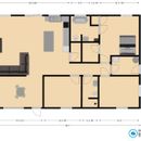
This is a fairly accurate version of the blueprints we’ve modified ourselves before sending them back to our engineer, but the dimensions are very close to accurate.
The top of the home faces the mountain views to the north. Inevitably having windows on the north side reduces efficiency, but we can’t sacrifice those views for obvious reasons. Clerestory is meant to bring light into the north and help with solar gain.
We wanted to go with a relatively simple, open floorplan, as the home will be just over 1400 sqft. Rooms are on one side of the home, common areas on the other. We have a 28×24 detached garage that isn’t pictured but is relevant for storage/workspace. We intend to loft our walk-in closet for ample storage, as well as the pantry if needed.
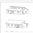
For the exterior views I’ve attached, we will be changing window placement around, as well as removing one window from the west side of the home. The high end of the clerestory faces the north (towards moutains), low end faces the south (towards the street).
We will be doing a hempcrete home with 12in walls for a tighter, more efficient envelope.
What are your thoughts on this design?
GBA Detail Library
A collection of one thousand construction details organized by climate and house part




Replies
Convergence,
It's a fairly straightforward plan. The common living spaces need to be reconfigured so you don't enter straight into what looks like the dining room, and it does seem to lack clothes storage space. Neither of the second bedrooms or the entry has a closet.
The basic shape is fine and functional, but what it lacks, and this may simply be because you are a preliminary design stage, is anything that adds presence or delight to the building. The main entry needs to be distinguishable and welcoming (I would add a roof over it, and extend the lower shed one six feet to cover the mudroom entry), and the exterior would benefit for being detailed so it is less shed like. Here is an example of a house with a very similar design where those things have been considered.
Edit: I should have credited the architect. It's by James Tuer of Vancouver.
https://jwtarchitecture.com/
The bedroom on the bottom right corner will have a closet. The one closest to the living room may also have one, we haven't decided that yet.
Our current house has a front door that enters into our small dining area and I've never had a big issue with it, but how would you adjust the space based on what you're saying?
Gotcha, so extend out the lower/front roof further to have a covered entry on the front door? Or would this roof need to be a separate structure? I get the overhang on the mudroom though, that makes sense.
Convergence,
I would remove the wall between the dining and the rest of the common areas, and swap functions so the dining area was next to the kitchen and the living area was at the front.
Ideally the lower shed roof could extend out much like the attached photo, but that depends on how high the first floor is above grade.
For the record, it's a half-wall that is open on top at a sloping angle towards the entrance between the rooms. Semi-open but enough separation for us.
I'm not sure where you are with reviewing/refining the layout for things like door swings. You may just not have got to that point yet, but here are a few things:
-I'd move the door for the master bath linen closet to enter from the bathroom. Two consecutive doors, and 3 on that wall will look clunky IMO. This yields wall space in the master BR. I'd also consider a pocket door for the master bath (a high quality unit, not a cheap hollow core).
-change the pantry door swing, RH inswing, or out-swing if you want more pantry space. Anything but how it's shown.
-move the stove away from the corner, counter space will be needed on both sides. Corner counter space is not ideal
-bedroom #3 door should be in-swing
-maybe look into stealing some space from the master bedroom for a larger mechanical room/mudroom
-need closet space for bedroom #2 and #3
I like the styling and Malcolm's feedback for the exterior detailing. Good luck with your build!
Not a proponent of putting all the plumbing together to save money, but I think if you moved the bath across the hall it might simplify things, and you might get away with the laundry worked in. Then you have room for the closet by the front door.
Definitely swap LR/DR. Kitchen noise in an open concept is anoooooooooooying. But I see the ceiling height you are after....
Look at the difference in the glass in Malcom's pic, you design has a lot of glass but won't look like it does.
THIS!
And the reason to move all the plumbing together is not really just to save money. It is for efficient hot water delivery. Do some reading or listening to Gary Klein and do your "hot water rectangle." I think you will find this one is almost 50% of the house.
You will waste alot of hot water waiting for hot water. Really need to rethink your plumbing layout.
Agree with all the comments from the others, especially Malcom Taylor's - you need presence.
Shameless plug--Gary Klein will be our guest on The BS+Beer Show on November 2, talking about hot water distribution.
Are you saying we put the bathroom on the bottom where our walk-in closet and pantry are?
crude representation
missing most closets and not to perfect scale
similar to one above but assuming water heater is bottom centerish, makes hot water runs short with few drawbacks
slightly less crude
I like the side entrance idea
IF the garage is to the right, mirror the layout
walk in closets are a waste of space, you always need an aisle so the are never as 'big' as they look.
Put a wall between the kitchen and the living room.
20 years 2 different open concept houses, clanging pots coffee grinders, there is a reason for walls.
I agree with all of the above! A foyer is a must in a quality design and should incorporate a roof, columns etc. on the exterior to provide focus at the entry. I would use a separate, small roof at the entry to 1. provide interest/texture to the exterior and 2. keep the roof edge from ending too low.
I think swapping the LR/DR is a great idea, unless you want the mountain view from your LR. In that case, I think it would work fine as is, as long as a foyer is added, which could work with the wall you are showing behind the couch. Also, if you are sure you want a separation wall, keep it half height to avoid making the common space look really cramped. Ideally, there wouldn't be a wall there at all, but it's your home and you should do what you want!
Door swings should generally go into the room you are accessing, not out into a hallway or another room. The Master Bath seems to have a lot of wasted space, unless you are planning to use a vanity and fixtures different from what is shown on the plan. And yes, the door to the linen closet should be moved inside the bathroom, or maybe consider using a cabinet instead to keep it more spacious. If you move the pantry door to the hallway side, you can use more of the wall space and add to your kitchen. It would also look nicer.
The LR area concerns me. I would advise you to play around with some accurate furniture sizes and different layouts to make sure that area is going to work for you. Right now it looks tight and not great for TV viewing.
Lastly, I would space the windows more consistently, especially the clerestory windows. Martin's photo shows it perfectly. It looks like you also have a different window type by the mudroom door. The window styles should ideally be the same.
Good luck and happy building!
WHy would you plan for 2 entrances in a compact floor plan? You have a french door in the living room (or what looks like it?), so you do have a second way to enter and exit if need be.
Given the garage/drive location do you envision using the side entry or dining room entry? I would eliminate one of them and make a proper entry with a closet wall. You can make a very good looking mud room (and still hide washer dryer in a closet if you wish) or a good closet wall that is efficient not obtrusive.
(1) If entering through dining room is preferred - if you eliminate the side door, you can use all the second entry square footage. The stacked washer can go into the pantry/remain and become part of a bathroom. You can do things like move the second bathroom into that space, then shift the bedroom into the second bathroom space, and build a "closet entry wall" by the dining room door. For coats, etc.
(2) if the side door is a preferred entry, then just eliminate the dining room door. It will feel more spacious.
Knowing you have a view on the upper part of the plan, I would have placed both dining area and living area there and moved kitchen to where the dining room is opposite wall. Similarly, I would have put one of the two bedrooms on the upper plan side (for your office? Since you are not building a closet in it it seems a possible use?). If you do intend to enter along the wall where the current dining room is , I would make a master suite take the whole corner (so your bathroom does not have the view - your office does). This way you shrink the hallway - hallways are a waste of space (because master suite is a dead end of the housE).
Like this?
I like your floor plan, for the reasons you state.
I wonder if the door in front is truly necessary (on the bottom) to be honest. Our mudroom entrance will likely be used more frequently since it is on the side of the house which will face the driveway/detached garage. We want a courtyard in between these two buildings, so the mudroom door makes more sense than the one in front. Are you saying to increase wall space and reduce heat transfer by removing that door?
We like the master bath on top for the mountain views when soaking in the tub. But thanks for giving us another option to consider, really appreciate your feedback here.
Convergence,
Maybe it might make more sense to create a formal entry and mudroom as one then? How far away is the detached garage? Perhaps it could be joined to the house by the extended lower shed roof, which would create a breezeway / entry. That would also give you covered outdoor space, which is a benefit in every climate.
We're planning to have it about 20-24 feet away to create a larger yard in between the two structures, so extending it for that purpose wouldn't really work. We would like to have a covered patio of some sort though.
Formal front entries that aren't used are the norm here in Maine; I always prefer to have a single, clear entry for everyone. It's not nice for guests to enter into the utility room, though, so you might want to rearrange spaces to make a better, all-in-one entry.
Please update us as you go into construction. I'm very interested to hear your experience with hempcrete.
You've got loads of good suggestions already so I'll just reiterate.
1. Take your time to do a careful furniture layout with accurately scaled furniture. I'd encourage you to step away from the computer. Print the plan out on paper. Cut out bits of paper to match furniture sizes and then play. You will find the physical aspect of moving bits of paper around is helpful. Also, very important, keep in mind the amount of space needed AROUND furniture, such as the space to move a dining chair to get in and out of it.
2. Please consider a front porch such as in Malcolm's photo. You may also be able to work in an entry coat closet (highly recommended) with your porch.
3. Will you be living here in retirement? Very important! Give a thought to mobility issues. Dead end narrow hallways are very difficult to move in with mobility issues. A turning point at the end of it would make all the difference. So take some time to think through how you would move around this house if you were confined to a wheelchair.
Last tip, if the 2 smaller bedrooms are mostly for guests, then look into IKEA's closet cabinets as a way to get some storage that is space-efficient. Design them in from the start.
Edit - Last, last tip. Design to a 2' module. You will probably gain space at almost no additional cost by eliminating waste from framing and sheet goods.
might should draw sections so you understand how the spaces work with the clerestory.
rough site plans would help understand space, views and solar effects.
exterior walls should be drawn full depth -- right now they are shown as 6"
are you using a heat pump hot water heater or plan to use one later? that cooling can be used to advantage with ductwork.
is there a kitchen exhaust fan? -- with just a plan view, how air exchange is maintained isn't indicated.
may take a look at susan susanka "not so big house" where there is a lot more "robbing peter to pay paul" to create more useful spaces in a small footprint. right now, each of your spaces does one thing.
Just re read
Your views are to the north[top of drawing. correct?]
you have the kitchen and bathroom on that side, and also in the 'tall' part of the roof
What if the kitchen was where the left most bedroom is
Living room has tall ceiling and view and is no longer in the kitchen. dining area has the more intimate ceiling. two bedrooms have the view. still work on consolidating plumbing
Yeah slide the kitchen straight down. move master bath to where the laundry[?] is.
two bedrooms with tall ceilings and views, plumbing a bit more centralized
Depending on how tall that clerestory is maybe a little sleeping loft in that bedroom
Or your attic space. delete the windows there and have more dramatic looking ones on either side...
I looked at your original plan and spent a lot of time trying to figure a better way of entering the house from the front without intruding into the dining room (and also providing a proper entry with a coat closet, a bench for taking off shoes, maybe a mail drop off shelf, etc) but now that I see that second option from orange_cat i think his idea to move the kitchen to where the dining room is now will solve all your problems.
I would also include shallow depth pantry cabinets along the right wall of the kitchen and move the front door a bit more to the left (eliminate the interior front entry hall door and put in an arched doorway) and in the front entry put the bench, shelf and coat closet.
As to the mountain view from the tub, at most you will spend one hour a day (a week?) in that tub. There is no more unpleasant feeling than standing up soaking wet in front of a large window. One, you will feel a cold, clammy draft from that window no matter how hot it is outside (wet skin radiates heat like crazy) and two, no woman feels comfortable climbing naked into and out of a tub in front of a large window even if the house is 100 miles out in the wilderness and there is zero chance of anyone seeing her naked. Don't plan the entire house around a view from a tub, place the bathrooms back to back and let someone in a bedroom enjoy the view.
Thanks for all of your helpful feedback! We've decided to scrap the door on the south side (bottom) and extend the roof out for the new front door through the side/mudroom. We're also moving the pantry door to the hallway to extend the counter space in the kitchen. And I think it also makes sense to utilize the rule of 2' someone mentioned, so our dimensions will extend out to make it 50x32, giving us a little extra room for the common areas that seemed a little tight before.
I've attached it to this post.
Hi Convergence,
I like your changes.
With the new pantry location/configuration, I wonder if there is any benefit to it being a "walk in"? It seems like you've gained a lot of kitchen counter space and corresponding storage below. Full walk-in pantries are great, but the functionality of a shallow depth (non walk-in pantry) is nice. You can see and find everything quickly. If you did a double wide non-walk in pantry you could gain space in your MB walk-in closet and W/D space. It looks like you could gain a bit from the master bath if you needed a few inches to make all the dims work.
Other things:
From appearance only, the scaling of the dining table looks off. It's about the size of a couch cushion.
As suggested in another post- I would definitely model all of the furniture, for example- it looks like your preference is to have the MB headboard in its current location. It looks like night stands and space on the wall side is tight.
Are your internal dimensions correct and reflective of the planned wall thickness?
Second update: Switched the master bath to align with where the clerestory windows come in, as the window in the current master seemed too invasive. Private clerestory windows make more sense. Also, moved the utilities to inside of our walk in closet to open up the front entrance mud room more as well as move water heater closer to wet walls. Pantry storage will be where the water heater is currently with built in storage.
Note: just realized I have the fridge hanging out in a weird spot here, please disregard
I would not have a washer and dryer inside your closet. That is just not good for clothes storage.I would move your bathroom back where it were - reduce window size/add privacy film/pout windows at eye level - then you can access washer-dryer from a shallow closet from the hall.
And is there no window in the second bathroom at all?
Now that the main entry is on the right, is there any reason to not put common areas on the right and bedrooms on the left? It is traditional to have the house entry away from the bedrooms and also carrying groceries past the bedrooms to the fridge seems like something you might want to avoid?
Also pantry seems to have disappeared from the plans - but I am guessing you wanted some storage somewhere?
And I would add a curbless walk-in in shower in master bathroom - you have the space - for aging in place.
I do not understand your kitchen-dining table preference (it looks like you want a separate room for a dining room which suggests you do not like the open space design. But somehow you do not mind having a kitchen island in the living room and the whole kitchen in an open space which suggests you do like an open floor plan? Eliminating pantry (or a pantry wall) seems like not a great tradeoff. You will see on one version I simply omitted the dining table as I do not understand your design intent, but there is definitely room for it.
Regardless, if one were to consider a more traditional floor plan - with public spaces (and kitchen) closer to the entryway, then something like this might work?
I did not move windows - one can add them in logical places (e.g. one of your bathrooms has no window at all and I do not understand why not? Having a daylight is nice and also energy saving? You can always add a privacy film if that is a concern.
We switched the plan around per your suggestions, as we thought it made sense both for flow and the proximity into our courtyard/detached garage. Let me know your thoughts on this, thanks!
I like it better than the one before.
I am not sure if it is washer dryer or something else taking up a corner of the master bath opening into you bedroom, but I would consider moving it into master closet with the door to the hallway. Whatever it is you want other people to access it not though your bedroom. Furthermore the "bump" is easy to hide in a closet - but in the bathroom it is just staring your in a face. It is too awkward.
Personally I would get rid of the second entrance (in the dining room) and half-wall, but that is just me. It will make your heat loss lower:).
Nobody is getting younger and I would put a curbless shower in at least one bathroom. It only takes one lift-and -twist and suddenly your back hurts and you want a walk-in shower. I would replace the bathtub in the other bathroom with a shower and/or add one to master bathtoorm. Shower over tub is not as enjoyable and you are building a pretty looking bathroom.
And may be move the woodstove towards the picture window wall - along sthe same wall as the window perhaps. Then the rest of the room would orient the same way - you want to design with focus on the view, and currently you are focusing away from it.
And I would access master closet directly from the bedroom (add sliding door or the door that swings into the closet and consider moving hinges for the master bedroom door to the other side), not through the bathroom. Improves the flow in the morning or evening. Otherwise you will be getting into each other's way.
Wow, that's a LOT better! You've solved just about every circulation path problem throughout the whole house.
A few minor details.
1. Put the master bed against the left wall. You should see the bed when you come in the room.
2. The hall bathroom wall with the door can come right a bit to give you a bigger vanity.
3. If you recess the master closet wall (the one facing into the hall) one foot you can add in a ton of shallow pantry storage along the hallway.
4. The dining room is huge. If you move the laundry closet part to the right (along with the door) you'll have a better sized mudroom/laundry and be able to add some counterspace along the left wall..
5. I would move the exterior door in the dining room south about 3 feet so you can put a buffet against the half wall.
6. I would add a couple of windows to the right side of the living room on either side of the wood stove.
Can you include a rudimentary site plan? Just add on where the garage, driveway, decks and sidewalks are?
Thinking about your plan last night, my chief concern is, where is your front door? I thought perhaps it was in the middle on the bottom but that is your laundry room. Your other door is on the left but that opens right into the dining room. Where do guests arrive and take off their coats/shoes, etc? Have you thought about a mudroom?
For an excellent series of books you can get from the library, I would suggest Architect Sarah Susanka's "The Not So Big House". She takes you through the entire process of arriving at and moving through a house and what spaces and features you should include to get the most function out of each room in as small a space as necessary while still looking beautiful.
Site plan would be helpful.
You need a walk in shower as noted above.
I would flip the master closet and the hall bath so your plumbing can be more efficient (cheaper to build and more important, much quicker hot water delivery). If you want natural light in the guest bath, add one of those tube type skylights. Bath windows are so very rarely opened and they are particularly problematic at a tub / shower. Then rearrange the master windows and make one of your outside walls the bed wall. You could then also potentially make the hall narrower and give that space to the bedrooms/baths.
The space between the sink and the kitchen island is ALOT. Also the island looks like it is pushed into the hall. I'd push it towards the kitchen sink wall.
Even if you don't watch tv/movies, consider where a future owner would put a tv in the Living Room. The wood stove seems right where you would want that.
The secondary bedrooms have no closets, so that can be problematic on many levels, including if you need an appraisal for financing - they may not count them as bedrooms.
Follow rockie's suggestion on the laundry room and taking some space from the dining room, shifting the side door toward the dining room and installing storage on the wall as you enter. But put the W/D on the left and the storage on the right. That will further reduce your hot water triangle.