Floorplan feedback
Planning stage for new house in NC, zone 3A…mixed humid. Site is just over 4 acres and will be a small horse farm. I’ve worked on the floorplan quite a bit and have gone through several iterations after feedback here and other places.
So the basics…
– No kids. Just me and my wife, but a fair amount of entertaining and guests
– Single story with rectangle envelope and simple gable roof
– House will face north…just slightly northwest
– Framed with 2×6 @ 24″ OC
– Current plan has exterior envelope frame dimensions of 52′ x 40′
– Wrap around porch
– Plan is to use ductless / ducted mini-splits for HVAC
– 9′ ceilings throughout (possibly a vaulted ceiling in the great room)
– 2 guest beds and separate office
– Covered outdoor living area at the back of the house
We both really liked the idea of a single large open “room” that would encompass the kitchen, dining, and living room across the south side (back) of the house. So I basically used this as a starting point.
I’ve tried to create public / private spaces with good separation, and I also tried to group the plumbing and hot water (kitchen, laundry, master bath). The exception is that the guest bath is further away.
So I would like feedback on what you guys think and what needs to be improved. I’m asking for the feedback and criticism, so I’m going in eyes wide open. I completely understand that not everyone is going to like the plan (possibly no one) and that’s OK. You’re not going to hurt my feelings. I truly want to know what the major flaws are and I’m sure there are many that I haven’t even realized yet.
That being said, one of my major concerns is the depth of the plan overall. It’s 3 rooms deep (4 if you count the front porch), which I already know is considered a bad thing. I’ve already been scolded on this :). I’m concerned about the natural light in the main hallway and in the great room (kitchen, dining, living). You can see the sliding glass door (8′ or 10′ wide) and windows in the great room, but I wonder if they will provide enough natural light to the room. I would like to have windows on two sides in the great room, but I’m hesitant to add west facing windows there. Possibly adding some clerestory windows on the west wall or the south wall in the kitchen? Would this help?
Also, I plan to have sidelites and possibly a transom above the front door, but I don’t know if this will be enough light in the main hallway, especially considering the front porch.
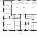
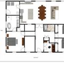
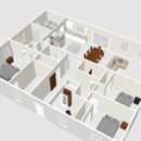
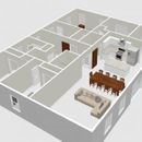
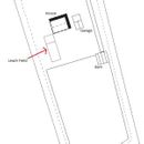
I’m attaching the floorplan with dimensions and also a copy that has some furniture to give a better idea of my intentions. I’m also including a couple of 3D image of the plan. Finally there is a image of the basic site layout with the spetic and leach field marked.
GBA Detail Library
A collection of one thousand construction details organized by climate and house part



Replies
Deleted
Deleted
You seem to be going for a symmetrical look to the house, in that the front door is centered in the middle of the north wall and the windows are evenly spaced along that wall. This creates a sense of formality for the house, but when you walk in all you see is a long empty hall with double doors at the end. You will never use those doors. They will remain open for the rest of your life so you should save your money and eliminate them.
Also, there's no front hall closet. I would decrease the width of that massive master bedroom walk-in closet by about 3 feet and build in a hall closet and space for a seating bench next to it..
That narrow hallway to the master bedroom is also boring. Decrease the depth of the master bedroom closet by 1' (leave the length of the wall the same so that it encloses the space where the main hall seating bench is) and also decrease the depth of the pantry by 1' and build in bookcases on each wall of that master bedroom hall. Now it's a destination with valuable storage and display areas rather than just being a space to walk through.
That 2nd little closet in the master bedroom isn't needed. I would turn it into more pantry space.
The rear entry door in the mudroom should be in alignment with the mudroom door into the kitchen (the laundry appliances will go against the back of the master bathroom wall with a folding counter on top.
Double doors into the office waste too much space. Get rid of the right hand inswing side so you have more room for a desk and chair.
Since your major sightline from the front door is the opposite wall in the great room make sure the door is centered on the main hallway (and make it a double outswing rather than a slider).
Finally, if you're not putting in a fireplace on the west great room wall then create an entertainment center with a low cabinet and TV in the center with higher bookcases on either side and high square windows above the bookcases.
Oh, and I would double up on the far right and left windows on the north façade. Single units are too small for the rooms.
Scott,
Thank you so much for the feedback. I certainly appreciate the detailed reply and ideas. You are correct in us wanting the symmetry. I need to post some elevations. In regards to the long hallway, do you feel that it is wide enough at 6'3" for a main entrance? The length is a bit of a concern. Also, my wife and I have differing opinions on the double doors between the hallway and great room. I like them, she does not. So they very well may get chunked, as I'm sure you know the old adage. I will say that my reasoning for including them was not entirely aesthetic, but to create additional privacy for the guest bedrooms in the event that people were still in the great room. Any value in this reasoning or no?
Your idea on the hall/coat closet is also something I've been considering...almost exactly the way you mentioned in carving the space out of the master closet for coat closet at the front. My hesitation is that we wanted to be able to hang clothes down both sides of the master closet and still walk in between them. It's just under 8' wide now so I wouldn't have much space to play with unless I rethink how we will use the master closet, which is certainly a possibility. As to the overall size of the master closet, it will also be storage for a couple of other medium to large sized items, so not just clothes. At any rate, excellent idea and one that I'm definitely working on.
The hallway to the master suite...I should have included the dimension on that. It's 3'5" wide. I have to say that I had not thought about the built-in idea. VERY cool idea. My wife is an avid reader and we had talked about spots for built-in bookcases, but for some reason, that hallway did not occur to me, but I'm definitely going to try to work that out. VERY cool idea...thank you for that!
Ok, so the additional little closet in the master bedroom...it's primary intention was a linen closet for our towels and sheets and it was initially much smaller (basically the area taken up by just the door) and perhaps could even have opened into bathroom instead of bedroom. But then I felt like the walk-in pantry was large enough at just under 8' long and 5' wide and I felt like enlarging the closet would be nice for additional storage. But I certainly understand your point on this, and I will give this more thought.
In regards to the side door into mud/laundry room...this is another spot that I have played around with a lot. My initial instinct was basically what you stated about lining the exterior door with the door that goes to the kitchen. Out of curiosity, what is your reasoning on this? My reason for moving it out of alignment like I did is so I could place the washer and dryer on the exterior wall and the dryer could easily be vented directly out the back wall with a very short duct run. Perhaps this is "planning overkill" and not necessary. I guess you can tell in the "furnished" image of the floorplan, but I should have mentioned that my intention for the mud/laundry/utility room is to house not only the washer and dryer, but also the hot water heater and electrical panel. That's the reason I made it the size that it is (10' x 10'6").
I actually really like the double doors for the office. I think it will make the front entrance feel more "open." I actually thought about scraping the doors altogether or perhaps doing a sliding barn door there as well. Regardless, point well taken.
We are definitely in agreement in making sure the rear door of the great room (sliding or otherwise) is centered and in-line with the front door so you have a sightline out the back. On the door itself, what's your reason for not wanting a slider there and using a double outswing instead? I wanted something that would be fairly large and provide a maximum amount of natural light. I was under the impression that quality sliders seal more effectively than double outswing or inswing doors, but I may be wrong on this. The air leakage would definitely be important to me on this. Your thoughts?
Definitely no fireplace. So the entertainment center with TV and bookcases are definitely my intention. You mention high square windows above the bookcases, which seems to tie back to what I mentioned about the possibility of clerestory windows on this west wall of the great room. I assume you meant something similar here, yes? This leads to my question regarding the depth of the house and the amount of natural light in the great room and main hallway. I would be very interested in your thoughts on this, especially the issue of the house being "too deep." How beneficial would the square windows that you mentioned be on that west wall or clerestory windows on the south wall in the kitchen above the cabinets?
Finally, you mentioned doubling the front windows on the far left and right. I had considered doubles for the master bedroom and front guest bedroom, but thought that I would have to make the office and master closet windows doubles as well to make the front elevation look right. Need to take another look at that.
Thank you again so much for the valuable feedback. I sincerely appreciate it.
Jason
Jason,
I really like your plan. I love the open concept and and privacy of the bedrooms.
If you haven't done so already, I would encourage you to start thinking about how the ERV and possibly mini split ducts will be arranged. You may have some really long runs. Not a huge issue but worth thinking about. A more centrally located closet might work well for these...
I always enjoy Scott's feedback. I wish I had posted my floorplan for him to review.
Rick,
Thank you for the reply. I have been thinking about the HVAC, and I have a very basic idea of what I want to do. Once I get the floorplan closer to finished, and get the windows and doors nailed down, I will be able to get load calculations and then get a better idea of how mini-splits would best work (ducted vs ductless, placement, etc.). I also have to work out a ventilation strategy. I would like to use spot ERVs if possible, but ducted may be a better option if I can figure out how to run the ducts (in soffits maybe?).
Agreed on Scott's feedback. Very informative and detailed.
Jason
I like Scott's feedback as well.
Random thoughts, since you asked:
- There seems to be a lot of square footage dedicated to hallways. Hallways aren't generally a big value add.
- Are both of you comfortable working/phoning/browsing computers in the same office? Need your own desks/workspaces/chairs? Perhaps instead of the double beds in the guest room you could have a Murphy bed or a pull-out love seat, and make that a second room for an office and/or away room for a separate, more private TV/reading area.
- Good to have a separate garage. Any thoughts on future-proofing for solar arrays or battery storage?
- Every place I've lived as an adult has had a fancy master bath with a fancy tub. Never used one once. (I use a small indoor hot tub in basement (usually) during the winter. I think of it as electric heating ;) ) Eliminating a tub allows you to make a nicer walk-in/handicap shower that you'll use every day, and probably make the expensive bathroom smaller and less expensive.
- Walk-in pantries are perhaps not the most space efficient storage.
- I echo Scott's comment about the current pathway through the mud/laundry room; seems to cut the room up a lot with the current layout.
- First floors should generally be ADA compliant, ie, think about door widths. If you add more sliding doors, consider how it might effect blocking added for grab bars, cabinets, etc.
- Private rooms are nice, and perhaps necessary with open floor plans, which I also tend to like.
Sorry that mine are mostly impressions, without specific suggestions on how to improve.
Have fun playing with ideas now while the changes are free.
Andrew,
Thank you for the reply. Thoughts and impressions are appreciated just as much.
The main foyer / hallway is a fair amount of space. The foyer along with the main hallway and master suite hallway, is about 220 sqft total.
I feel like the single office will serve our needs as neither of us primarily work from home, and very rarely, if ever, at the same time.
Detached garage is a definite. I have thought about planning for solar in the future.
On the tub issue...this is a wife request. She's a soak tub fan. I certainly understand your point about eliminating it in favor of space and money, but she does (and will) use it. So it's a small price to pay to see her happy, as I would gladly pay more and give up more space if necessary to accomplish that. BTW...the really nice Kohler freestanding with heat and air massage...those boogers are NOT cheap.
I agree with you on the alignment of the doors in the mud/laundry room. See my comments above in reply to Scott.
Since our plan is to spend the rest of our lives here, I have tried to think about accessibility in regards to doors and hallways, and the shower, etc. Very good point about adding blocking for grab bars in the future.
Totally agree on the private rooms. I definitely tried to give the bedrooms a sense of privacy.
Again, thank you for the input. Sincerely appreciated.
Jason
Jason,
One of the joys of building on large rural lots is not being constrained by the limitations other situations often bring. So I'd tend to take the opportunity to really engage the site, rather than start the design with a box you then subdivide into the rooms you want.
Ranches come with their own imagery and way of relating to the land around them. They tend to be spread out and a bit porous. Seeing as many of the rooms you have are for occasional use by guests, why not separate them out from the main house - perhaps by a breezeway - which would give both sides more privacy, provide covered outdo0or space, and give you more opportunities to allow main house to have less depth, meaning the rooms are all on the perimeter.
Remember that the starting point for y0ur design shouldn't be efficiency - that can be incorporated as you go - it should be creating something that makes everyone who lives there or visits happy and incorporates elements that delight.
Here are a few links. Not as suggestions, but rather showing how loosening things up a bit can yield interesting results.
https://www.lakeflato.com/projects/ranches
https://www.contemporist.com/bowen-island-house-by-sturgess-architecture/
https://www.affleckdelariva.com/en/projects/minton-hill-house/
Malcolm,
As always, your input is certainly appreciated. I completely understand your point about not making efficiency the driving factor. We truly like the basic and simple lines of it. It's pretty cool that building simple is usually more economical and efficient, but that wasn't the primary focus initially. I've always been drawn to simple American farmhouses...sort of boxy with a wrap around porch...something about it just draws me to it. That being said, I have played around with other ideas, some not unlike what you mentioned about spreading things out. I've tried moving toward more of an L-shape. I've tried reducing the width and lengthening the whole thing. I still have a couple of sketch ideas that I'm looking at and I may feel differently at some point, but I really do like the current layout that I posted with the exception of the potential natural light issues that I mentioned.
On a different note, I do a lot of real estate photography, so I'm in and out of a lot of houses. It's really cool because I get to see and experience a lot of different designs and ideas first hand...many of which I like, and many of which I really, really, don't like at all. On your point about creating something that makes us happy and incorporates elements that delight, I completely agree, and that's truly been my intention. It just happens to be that basic and simple is what usually makes us happy and makes us feel "at home."
All that said, thank you for the links...some of those images create some really interesting and cool ideas, and that's what this is all about.
Do you have any thoughts on the natural light situation in the floorplan that I posted?
Jason
That “wrap around porch” you like is a “veranda”. Those are classic on rural housing, and very nice when you have good weather and a breeze. A rocking chair or suspended swinging bench will give you the full package :-)
Regarding the outdoor part, I would do a lot of thinking about which directions give you the best views. When you have a big, beautiful lot, you want to SEE it. I live on a big lot with a small lake, and have a large window wall facing that lake. It’s to the north, but that’s where the best view is. I wish I had more southern windows to bring in more light, but I wouldn’t want to loose the view.
If you have some photography experience you’ll have a better idea than most to frame your view. Think of the window as your frame, imagine what you’re going to see through each on. Have a big vista? Maybe that’s the spot for a big sliding glass door or a series of picture windows with narrow frames.
For a little out of the box thinking, look into the way the landscape photographers setup their shots. There is a wealth of artistic info for this sort of thing at photographylife.com. I highly recommend you read some of the artistic articles there (the site is not just equipment reviews). You may get some ideas from some of their images, but they also explain some of the artistic composition stuff that goes into the images.
Bill
Jason,
I didn't mean to dismiss your efforts. It definitely looks like somewhere you will enjoy living. What it needs now is some real punch to make it special. Probably a lot of that can come from the elevations, which I'd really like to see.
The sequence of arrival in your floor plan leads invitingly to the large main living spaces. I would make these something that was worth waiting to see. Incorporating the vaulted ceiling you mention over that area - ideally with a shed dormer to bring light in from above, would definitely be something to consider. Whether you go with french doors to the living areas or not, I'd put a glass ransom above to define the space.
Scott's points are well taken - especially the idea of making the hall to your master bedroom interesting in it's own right.
Malcolm,
I didn't feel as if you were being dismissive. I agree with you on the "punch." I have thought about a vaulted ceiling in the great room, but my intention was to do a trussed gable roof with a vented attic. Thought about maybe having a vault built into the raised heel truss on that half at maybe a 4/12 pitch. I think this could be done without changing much framing, attic, or insulation wise. Seems like this type of vaulted roof plane could be air sealed and insulated the same way the flat would be.
On a slightly different note (sort of a "throwing stuff out there" tangent) ...I really like the look of exposed timber frame trusses, but I'm not sure how this could be done for just the great room with the front half of the house remaining flat ceiling. I've thought about the interior wall of the great room that runs all the way to the master bath...I suppose it could be a load bearing wall if that would provide a way to make this happen, but I'm just not sure what this would look like frame wise. I suppose the correct way to do it would involve a full cathedral ceiling and moving the air barrier and insulation to the roof line. I know it's a tangent, but out of sheer curiosity, what are your thoughts on this?
Jason
Json,
There are a number of alternatives
for the roof over the main living area, which vary in complexity. Just to be clear though - is the roof a simple gable running north to south?
Malcolm,
The ridge of the gable runs east to west...the 52' dimension.
I'm attaching some very simplified front exterior shots...I stress the simplified part. My wife really likes the look of a centered dormer. She calls it "character" and while I'm not a fan of "fake," she has me considering a fake dormer like the one in the third and fourth attachment that doesn't actually break the roof plane. I'm trying to figure out how to win on this one, but I'm not sure it's a hill I want to die on.
At any rate, this gives you a better idea of what I'm thinking for the exterior.
Please let me know what you think. Also, your thoughts on the best option for the vault in the great room?
That “wrap around porch” you like is a “veranda”. Those are classic on rural housing, and very nice when you have good weather and a breeze. A rocking chair or suspended swinging bench will give you the full package :-)
Regarding the outdoor part, I would do a lot of thinking about which directions give you the best views. When you have a big, beautiful lot, you want to SEE it. I live on a big lot with a small lake, and have a large window wall facing that lake. It’s to the north, but that’s where the best view is. I wish I had more southern windows to bring in more light, but I wouldn’t want to loose the view.
If you have some photography experience you’ll have a better idea than most to frame your view. Think of the window as your frame, imagine what you’re going to see through each on. Have a big vista? Maybe that’s the spot for a big sliding glass door or a series of picture windows with narrow frames.
For a little out of the box thinking, look into the way the landscape photographers setup their shots. There is a wealth of artistic info for this sort of thing at photographylife.com. I highly recommend you read some of the artistic articles there (the site is not just equipment reviews). You may get some ideas from some of their images, but they also explain some of the artistic composition stuff that goes into the images. You’ll want to walk the site a bunch to find out where the best views are.
Bill
Bill,
My apologies...I missed your reply initially. You make a very good point about the views, and being a photographer (one with a fair amount of landscape experience), I'm definitely attuned to views.
Definitely in agreement on the swing and rocking chairs. :)
For bringing in light, I put a larger clerestory window into the roof along the of the living space. Diffuse natural light up high is a great thing.
It did make the roof a bit more complicated to build but definitely worth it.
Akos,
I am considering some larger clerestory windows as a possibility. Do you have a picture of what you did?
Here is a couple of shots. The roof is pretty simple construction. There is a structural beam down the middle of the house, this supports a shed roof for the lower section bellow the clerestory and a gabled roof above it. It is all stick built.
In my case the window faces south for wintertime solar gain, further south, you probably want it facing north.
I would second never building fake dormers. If you build it, put a window in it, it makes a big difference in interior natural light.
Walk in anything wastes space. It looks big but serves no purpose, you cannot pile things in the middle of that walk in closet
That hall to the master is also a waste.
I suggest removing the hall and the walk in and rethinking that space. You could end up with some useful space in the master for a sitting area or reading area or .......
I agree that the entry doesn't open well into the living space, but don't have an answer
Maybe some of that hallway could be a powder room, not worrying about the state of the family bath when guests come over is nice.
Keith,
Thank you for the input. I understand your point on wasted space and I will certainly give it some more thought. Much appreciated.
Jason
Which way does the roofline run? Will the roof overhang provide good shading for the south windows?
Privacy for guest would be better accomplished with a door on the hallway off the foyer rather than a door between the foyer and the great room.
If the roof has enough pitch, you can do a scissor truss to get a higher ceiling in the great room and still have a vented attic.
I disagree with Keith that walk-in closets are a waste of space. Our walk-in master closet is 6' wide and that gives us plenty of space for clothes along both walls. Our previous house had 5'6" wide walk-in closet which was definitely too narrow.
We find that we rarely shut the door to our walk-in pantry. The location of our pantry makes it not be an eyesore from the kitchen / family room.
Did you consider shifting the master closet over so the hallway to the bedroom is at the front of the house. That puts the window in the hallway instead of the closet. I don't like windows into a closet. I don't need to look outside when I am in the closet and I don't want people on my porch looking into my closet.
The only room that looks to me like it would have a natural light issue is the foyer. Other interior rooms don't need natural light.
I would make the master linen closet open into the master bathroom. I would extend the pantry to the east and put a normal door into it. Then, I would put additional kitchen cabinets along the north wall of the kitchen. You could avoid having a buried corner cabinet.
In the kitchen, I would move the sink to the island to make a better work triangle.
You might be able to get the look of exposed timber frames in the great room using fake beams.
Reid,
Roofline runs east to west...length of house. See attachments above in post #18. To answer your question on overhangs on the south side...I'm planning a back porch / outdoor living area that will either be covered or perhaps a large timber pergola with some shading. Either way, I would make certain that there is good shading for the south windows to block summer sun...overhang or otherwise.
I had not thought about a door on the hallway to the guest bedrooms. Very interesting thought. I think you could be right in regards to privacy. Thank you for this. I will definitely give it some thought.
Probably doing an 8/12 pitch on the roof. Using a scissor is basically what I had in mind. The vault (scissor) could be built into that half of the truss. See my reply to Malcolm in post #14 above.
While I do understand Keith's point on wasted space, I do like the walk-in closet, but perhaps that is only because I'm used to it after years of having one. I think the organization of the closet plays a big part in this as well. Obviously, some walk-ins have a more efficient use of space than others.
It is my hope that the pantry would look great with the door open or closed :)
In regards to moving the master hallway to the front of the house...funny that you should mention it. I've actually given it a lot of thought and looked at it quite a bit. I think it does have some advantages. I, too, would prefer the window being in the hallway vs. the closet. However, there are some cons. First, I feel like it moves the entrance of the master much too far away from the main part of the house, especially considering that we (my wife and I) would probably use the side door more than the front door. Where it is now just "feels" right to me. Also, I like the fact that where it is now breaks up the long east wall of the hallway, which we've already established is maybe somewhat of an issue itself.
My main concerns in regards to natural light are the foyer/main hallway and the great room. Do you feel like the great room would be well lit during the day without additional lighting? Any ideas on what could be done for the foyer/hallway?
The master linen closet opening into the master bath is another one that I've gone back and forth on. I like your idea about avoiding the buried corner cabinet...food for thought.
I initially considered the sink in the island, but it's not going to happen. My wife stated pretty emphatically that she didn't like the idea. So where do you put the kitchen sink in the house that you're building with your wife? I'm sure you can guess correctly. :)
I've seen the faux wood beams and while some of them look pretty good, I'm such a non-fan of "fake" stuff that I just don't know if I could bring myself to do it.
Thank you for some really interesting ideas. Much appreciated.
Jason
The plan is a good first draft, but I think you should consider some major revisions before you build.
You note one of the key criticisms in your post: the house is quite deep. A clerestory is a solution, but given that this house is only for two people, I'd recommend simply reducing the size of the house. Everyone likes the idea of providing space for guests, but two extra bedrooms is quite a lot. Obviously, I can't say for sure that you won't get use out of them, but in my experience most people who think they need two guest bedrooms are usually wrong. And it is a lot of space that will be frequently empty. Unless you frequently plan on having multiple people sleeping over at the same time, I would recommend keeping the number of guests bedrooms at one and keeping a spare bed in the office for flexibility. This is green building advisor after all, and the greenest thing to do (in single family housing) is to keep things small.
On the topic of saving space, I'd cut a few square feet from that walk-in closet as well. Walk-ins are not a very efficient way to store things, and by reducing square footage you free up more budget for things like built-ins, which are far more convenient. I'd also advise swapping the positions of the master bath and closet: that way you can make it so the laundry room is directly accessible from the closet, instead of following a circuitous path through the kitchen, dining room, two hallways, and master bedroom.
The "single room" open concept kitchen/dining/living room has been very popular recently, but it comes with some serious drawbacks. Of course, if you never actually cook (like the owners of many fancy open-concept homes) then you can put the kitchen where ever you want without consequence. But if you do use the kitchen, then some issues arise. The first is acoustics: making food is often a noisy affair, and it can be seriously distracting to someone trying to watch a movie when there is nothing to block the sound. It also means the kitchen is always on full display, making its cleanliness very important. All the same, kitchens now serve social functions as well, so isolating it from the home is not desirable either. I lean towards the middle ground of joining the rooms in an L shape, with the dining area being the corner connecting the kitchen and living room together. This provides a little more acoustic separation, and allows you to entertain impromptu guests in the living room without having to worry about the cleanliness of the kitchen.
As others have pointed out, that long foyer is far from ideal, and you should avoid unnecessary hallways as much as possible. Switching to that L-shaped entertaining space should help with that: it will allow you to bring your living room (or kitchen) closer to the northern entrance without giving up access to that desirable southern light.
The porch placement could also be improved. As it stands now, the porch is not directly connected to any social rooms, which greatly reduces the likelihood that it is used. Ideally, you want to be able to access the porch easily from the living room, to enable a casual trip to the outdoors should someone notice nice weather, and move back inside without interrupting the socializing when it grows dark. In general, it is also worthwhile to bump out a section of the porch to be at least 10' deep, to allow for a small table and some chairs. I don't see dimensions for it on your plan, but I wouldn't do a depth of less than 6' for the rest, if you want any sort of furniture.
Back from the long weekend. I drew out your plan from memory so the scale and proportions of the rooms aren't quite right but I hope you'll see my intentions.
I sense that your "style" of house will be a slightly more formal version of country farmhouse but one of the things you need to consider is how guests will arrive at the front door. All the functions available in the mudroom should be duplicated at the front door (although in a more "formal" way) so you'll need a place for guests to sit down and take off wet shoes, a closet for shoes and coats and maybe a low cabinet for putting down items, etc.
I've shown the front hall with space for a seating bench carved out of part of the master closet but you could also put a chair and credenza there. The linen closet around the corner is now the hall closet (you don't need that much linen storage). 6'3" is a fine width for the main hall but it needs more function and visual interest. It shouldn't be just an empty space that you walk through to get somewhere else.
The width of 3'5" for the master bedroom hallway is also fine but if you push the side walls back 1' on either side you can add bookcases to the hall. By eliminating the little linen closet opening into the bedroom you can expand the pantry and then put display shelving in the master bedroom. A storage cabinet can go behind the bathroom door.
In the main hall the west pantry wall has been pulled back 1' and display shelving or bookcases are installed there.
I narrowed the width of the great room by 1' to provide depth for built-in display shelving on the north living room wall. Never think of building a blank wall without considering how to include storage. Just by adding 1' of depth gives you a vast amount of storage.
The west great room wall has a low TV cabinet (maybe 24" -30" high) with bookcases on either side (maybe 5' - 7' high) with square windows above them. The windows can be higher up or they can be at viewing height depending on the bookcase height.
I've doubled up the windows in the kitchen, great room, master bedroom and front bedroom, centered one double door on the front door and added a second to create a greater sense of connection to the outdoors. I think double doors are more elegant than sliders and both doors can be open at the same time (unlike a slider). Just my preference.
The exterior mudroom door should be in alignment with the kitchen door because people naturally want to move in a straight line through a room and if they have to turn and walk through the room at an angle they get annoyed. It's true. The washer and dryer can be plumbed through the master bath wall and the dryer vented through the side wall to the exterior (the hot water tank could go on that wall too). On the other wall you can put in a bench by the kitchen door, some storage lockers and the electrical panel.
If you want double doors to the office that's fine as long as the furniture layout still works but double doors to the great room will never be used. Noise from the great room shouldn't be an issue in the guest rooms but you might consider insulating the interior walls with Safe and Sound). Double doors in the main hall to the guest rooms will also never be used although you might create a timber post and beam arch at the entrance to the guest room hallway. Psychologically the timber frame arch will create a separate, more private "zone".
As to the little fake roof dormer......DON'T DO IT! It will look cheap from the day it is built but since you mentioned you are considering timber beams (or trusses) in the great room I would run one beam or truss from the corner of the main hall side walls across the great room to the exterior wall (if your main hall is 6'3" across then the ceiling beams or trusses will be 6'3" apart). Then install a shed dormer between the beams in the great room and a matching one over the main hall. In effect, the great room and the main hall would both have cathedral ceilings (you could also create a timber arch at the end of the main hall going right up to the ridge beam). Tons of light and a beautiful view through the center of the house.
Jason,
I would follow all of Scott's suggestions. The only modification I might suggest is that the shed-dormer over the entry be the width of the hall, but that the one in the main living area be much larger, spanning from the kitchen wall to point equidistant from the centreline of the house over the dining area. All this can be done with trusses. No need for load-bearing walls, although one or two point loads might make the trusses cheaper.
The elevations need weight. Add thick fascias on the dormers and gables. The posts on the porch should be doubled up or made more substantial. Perhaps drop the beam that supports them.
On the south side, consider adding Brise Soleil over the windows and doors for direct sunlight.
Think through the relationship of the porch to the surrounding yard. Right now it's a bit of both a separate porch which should then probably have railings to define it, or an open one which might benefit from continuous steps around it.
Many of the ideas we are talking about are embodied in this house by Kaplan-Thompson:
https://www.kaplanthompson.com/project/joslin-hill-passive-house/
Malcolm,
I'm still trying to absorb all the info that Scott gave me...it's a lot to take in.
The exterior images are very rough and simplified. I added the posts and porch just so you could get an idea of what I was thinking. It wasn't intended to be detailed at all. I completely agree that it needs weight...posts more substantial, fascias on the gables, etc. I most likely would add railings on the porch, but I thought your idea about continuous steps was intriguing.
Also, I wasn't familiar with Brise Soleil. So thank you for that. :) Very interesting.
Questions for you...
I think I get what you guys are talking about regarding the shed dormers. You mentioned that it could be done with trusses, but we're talking about moving the air barrier and insulation to the roof line for the entire roof, correct? From my understanding, that makes things much more complicated and costly, with more room for error vs a vented attic with the air barrier and insulation at the ceiling plane, yes? Or am I totally mistaken on this?
Jason
Jason,
The air-barrier remains at the ceiling, and the entire roof is still vented. All that occurs is that the main gable-trusses are interrupted by a girder-truss, and from that smaller triangular trusses form shed dormers.
Malcolm,
I'm trying to understand how this is possible and I'm just not quite there yet. Please see my reply to Scott in post #29 below. Was hoping you might be able to help me understand it. I've tried to find better detail images, but haven't had any luck so far.
In response to comment #25, aren't you creating a cathedral ceiling in your great room? I seem to recall the mention of scissor trusses or beams. If so, that section of the roof would have to be built a certain way and therefore it shouldn't be too difficult to continue that type of roof over the front main hall.
My idea is to vault the ceiling over the main hall to match the vaulted ceiling in the great room. At the end of the main hall I suggest placing 8 x 8" timber posts (shown on the drawings as blue squares) running up to a timber beam at the ceiling. These two posts will sit up against the hall's side walls. Depending on what you like you could add cross braces between the posts (I show two in the pictures but they could be placed anywhere).
At the entrances to the master bedroom hallway and the guest hallway I suggest a timber frame around the opening. The posts at the master bedroom hall can be built into the walls but for the guest hallway entrance you could get away with using 1' thick barn board just to create the effect of timber beams (that way true 8 x 8" posts don't intrude into the interior of the bathroom and hall closet).
I show a dormer over the great room (as per Malcolm's suggestion in comment #24) but you could also just do a matching dormer to the one over the main hall. A wider dormer in the great room is more traditional while a narrower one would be more modern.
For the dormer windows you could do either one wide window or two narrower windows centered between the ceiling beams ( or trusses) and the dormer walls. The main floor windows should be centered under the dormer windows.
Few more pics. If you really wanted to tie the great room and front hall together you could create a timber "band" around the front hall at the height of the master and guest hall lintels. In effect, by applying 1" thick barn board to the walls at the height of the lintels and wrapping it around the room, and then again applying barn board to the wall at the top where it meets the ceiling it looks like there are timber beams holding up the walls and roof when in fact it's just a decorative paneling.
Scott,
First of all, thank you again for all the input and ideas. It is more appreciated than you can imagine. I'm slowly working through and digesting all of your ideas and suggestions, and I will have more comments and questions on a few of them I'm sure. The images are awesome and a tremendous help. Thank you for those!
To answer your initial question, yes...I was considering having a vault built into the portion of the truss over the great room. This would give me a vaulted ceiling while maintaining a typical vented attic with the air barrier and insulation at the ceiling plane. This one is easy for me to understand...
What I'm having trouble with is the implementation of the shed dormer per your and Malcolm's suggestions. Bear with me...I can be a little dense on occasion. I'm attaching two exterior shed dormer images...one flush and one not. Am I correct in assuming that what you had in mind was the flush type? It appears that way, but I wasn't sure.
Malcolm mentioned that it could be done with trusses and that the air barrier and insulation would remain at the ceiling plane while maintaining a fully vented attic. I'm having trouble seeing how this would work. It seems to me like it would require moving the air barrier and insulation to the roof line, like a full cathedral ceiling, at least for the roof of the dormer anyway. I've tried to find a framing detail for the shed dormer that would help me better understand the situation, but so far have not had any luck. I'm sure I'm just not seeing it. Is a rough sketch or image possible that might help me find the light switch?
Jason,
The difference between whether the main roof continues under the dormer only affects window placement. In both cases the dormer should line up with the exterior wall.
Scott is suggesting something a bit different than I was. He shows the area between the regular gable trusses framed with timbers - so yes in that case the air-barrier moves up and the structure is not all trusses.
I'm suggesting a more modest change, which is to interrupt the gable trusses where the dormers are, add a girder truss, and attach smaller trusses to it to frame the dormers.
I've attached two very quick sections. The first shows the way you had the roof framed. The second shows the trusses interrupted by the dormers. The main differences between this and Scotts option is that the heightened being only occurs over the dormers not the entire central hall, and that the ceiling of the dormers is flat not sloped.
Malcolm,
Sorry I didn't get back to you sooner. Between work and the close pass of Mr. Dorian a few days ago, I've been a little preoccupied.
Thank you for the drawings. It definitely makes more sense now. I can see how this could be accomplished while maintaining a fully vented attic. The floor of the attic will just be higher in some places than others.
I'm still working through Scott's suggestions and making changes accordingly. I'm sure I'll have more questions for you moving forward. Thank you again.
For a simple shed dormer, if you have an interior load bearing wall, a stepped truss or studio vault might be simpler.
As for the air barrier, it is still just a single ceiling plane, is now not completely horizontal.
This would mean that you would need to insulate the vertical sections with batts. The area on top of the insulation (even the vertical sections) is still open to the attic and can be vented with standard eave/ridge/gable vents.
EDIT: I was thinking of a different roof layout, with the shed dormer as shown above, the vertical sections get built as an exterior wall. The air barrier is still the inside drywall and should still be continuous from the ceiling bellow all the way to the ceiling of the dormer.
Akos,
This definitely makes more sense to me now after the explanations along Malcolm's sketches.
There are many different options for framing in a shed dormer. I was thinking of the type with a cathedral ceiling on the underside of the roof plane but Malcolms suggestion of using small trusses and having a flat ceiling plane might work as well (depending on the two roof slopes). For my drawings I used a main roof slope of 6:12 and a dormer slope of 2:12. The front wall of the dormers are flush with the lower walls. Of course you could use any roof slopes you wanted, as well as size and placement of the windows, but my personal preference is for the sloping cathedral ceiling look. I just think it's more dramatic that a higher flat ceiling.
But now some math!
Since the house has a symmetrical layout based around a central main hall I was thinking that the recesses in the main hall should also be symmetrical. In my drawing, if you look at the master bedroom door you will see that the master bedroom hall has been widened to 5'9" in order to include 1' deep bookcases on either side. At the end of the master bedroom hall there are two timber posts framing the opening (blue squares) that can be either 6x6 or 8x8's.
Dimension "A" (6' 6") is the width of the built in bookcase recessed into the west pantry wall. To keep the symmetry in the hall the opening recessed into the master bedroom closet ("B") should also be 6' 6" (the short walls "C" will be the same width).
Of course, the depth of your pantry may be less than 6' 6", so if it is 6', or 5' 6" or even 7' then the master bedroom recess should be the same. This will keep everything symmetrical.
The last 3 pictures show what the massing of the house would look like with the shed dormers.
Scott,
Thank you so much for your time and advice. The drawings and images are a tremendous help. I'm still working through all of your suggestions and reworking some things accordingly. The idea of built-in bookcase in the master hallway was a big hit with the wife :).
One thing I should have mentioned...I'm a photographer and my wife is an art buff, so what may appear to be "empty wall space" also has a purpose for us. My intention is for a portion of the main hallway to be a gallery of sorts. That being said, your built-in suggestions have definitely been eye-opening.
I also now understand your point about the exterior mud room door being aligned with the door into the kitchen, and I have made that change and adjusted the mud room accordingly. It does flow better.
Also, after giving it some thought, I'm in agreement on the double doors from the hallway into the great room. They have been pulled from the plan. I'm playing around with the timber post idea and really like the direction its headed.
At any rate, you have definitely helped me take a step in the right direction. Thank you so much for the suggestions and advice. MUCH appreciated. I'm sure I'll have a question or two for you soon. :)
Jason
This article on framing may help, but you have to be a member.
https://www.finehomebuilding.com/2008/11/12/frame-a-classic-shed-dormer