Feedback on Floor Plan, Take Two
Hi Everyone,
I had a thread from October where a large number of community members provided useful feedback on how to improve the layout and flow of floor plans my wife and I plan on using to build in CT.
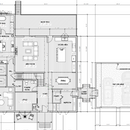
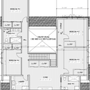
Barring any further epiphanies, my wife and I are largely settled on the plans, now, and I wanted to share them to see if there’s something boneheaded we’ve missed. The large first-floor primary suite has a more useable layout now, although I’m sure plenty here won’t be fans, and the rooflines aren’t as simple as I’d like, but my wife likes them!
As always, any feedback is greatly appreciated, and thank you again for your assistance!
GBA Detail Library
A collection of one thousand construction details organized by climate and house part



Replies
There are definitely improvements!
Did you add another bedroom to the upstairs?
The main comment is to relook at how much of this house is taken up by halls, and see what you can rearrange to reduce that; either make that space useful for something, or you can make the house smaller, which at this point you probably won't do - you will just benefit from uses that are better than hallways. There is a prime opportunity for that in the upstairs, especially to the right. I also think you will get very tired of that long walk to the master bath, especially if someone is ill. There is no reason the master bath and the adjacent full bath have to be rectangles - you can at least move the master toilet room closer to the bedroom.
If you are at all concerned about how the house will appraise you can add a closet to the office on the first level and it will count as a bedroom.
If you are concerned about building a tight house, which since you are at GBA, I presume you are, you may wish to think about the many 2x operable windows. I did the same in my house, thinking I would want the opportunity for either window to open. In reality, you really only need one, and if you change the other to a fixed window it will be tighter.
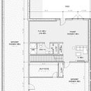
- We decided to move the 2nd bedroom on the first floor upstairs, my wife wants the vaulted ceiling, which prevent us from putting the bedroom over the great room
- Windows are the one thing we're working through - at least half the windows will be non-operable for sure. We're talking to a few vendors now
- Good tip on the office closet; thanks!
david_solar,
If these plans are pretty much fixed - and I agree with User ...022 that they have way too much space devoted to circulation, - consider moving some of the doors to rooms to both perceptually shorten the halls, allow space for the swing, and provide more privacy.
Consider moving the door to the en-suite bathroom up about four feet, moving the door to bedroom #5 down the same distance., and swapping the storage and cupboard at bedroom #2 so you can move that door down too.
Corridors and hallways are liminal spaces. That is they aren't really places at all, and only exist in relationship to the rooms they serve, and that makes them uncomfortable. Two ways to deal with that are to try and incorporate as much of them into a room as possible, or to widen them out and provide a focus (a book shelf or niche) so they become places on their own.
Malcolm, thank you for your feedback. I couldn't figure out how to deal with the corridor in the primary BR, but someone elsewhere did it for me - their sketch is attached here.
Also agree about moving the door to bedroom 2 to make the entrance to that room easier/faster - attached two versions of a fix for that
Those changes look a lot better to me.
david_solar,
Good stuff!
Putting the master bath at the back of the house takes away access to the deck from the primary bedroom. I would not appreciate this, but some may think it is a benefit...
This also takes away the second full bath on the main; if I properly recall your previous post that full bath needed to be part of the program due to the possibility of a mobility impaired relative living in one of the rooms.
I've attached a small suggestion for the upstairs bedrooms. It's on the right side of the image. You get a shorter hallway, larger closets, and no loss to the bedroom spaces.
edit - Looking at it again a few minutes later, I'd also move the bedroom 3 door next to the storage closet. This would allow for better furniture arrangements in the bedroom and keep the bedroom more private from the foyer.
This is a better solution than the ones I put together, especially when the BR3 door is moved as well - thank you!
MUCH better!!
Do this and move the door as jollygreenshortguy posted.
I often design smaller dining areas than my colleagues, and I often make them do double-duty as circulation space as you have done. But your dining area is the main pathway from the garage entry (which where I live is where 90% of guests would go as well) to the rest of the house and if people are seated at the table there won't be enough space to walk between it and the island; they will be forced to navigate through the kitchen, which is ok occasionally but awkward if it happens often.
I agree with what the others have said about circulation space. I aim for no more than 10% of the floor area to be dedicated to circulation, not including spaces that do double duty. Designing an efficient home is harder than it looks! I do it every day and still find it challenging after 20 years.
David Solar,
Well, I guess everyone isn't done with you yet. So here goes...
I hope my presenting a same but different plan idea at this late date doesn't cause strife, but I actually had them done some time back but the thread died off, so I didn't post then.
I see from the first floor plan you posted recently that it looks identical to the earlier post and the second floor has undergone a major change. From one of your comments I think perhaps you didn't post the updated first floor. In any case, I am presenting my take on how to do what you are trying to achieve with the goal of improving traffic flow in a potentially active household and give you a bit of age in place options. It also conserves the open ceiling above the kitchen and may simplify the roof planes. I am sensing a large snow trap being created by the updated second floor plan.
The biggest revisions I would urge involve the stair directions and basement access. The prior plans have the internal basement access point in the hall feeding the master and other 1st floor bedroom. If I may point out that it makes everyone tromp thru the living room to get to the basement. If snacks or younger guests are coming and going it makes for a long trip from the kitchen. I note the lower access, but walking around the entire house to keep traffic down inside still doesn't account for snack movements.
In the entry hall I have left two doors on the plan showing either straight down access or a door on the hall side of the stairs for more sensible kitchen to basement snack tracking. The min-hall at the corner of the living room allows for a more private stair access and as you can see two variants for handling bath access for company. Currently company would have to go back to the garage entry or into a bedroom. In a large household it might hard to send everyone thru the boots and coats chaos to find relief.
I have rather altered the upstairs compared to the new posting, but it still leaves a total of five bedrooms. The modified Jack and Jill bath layout provides for what I think are better closet spaces. The one bath-ette has a linen cabinet. Another linen closet is over the stairs. The nine foot first floor ceilings allow for sneaking a bit off the down end of the stairs. The free space at the top of the stairs is less room like, but I wonder if the grand space in your version will get used as a second living room or become a bit orphaned as people seek some level of isolation from family.
There are of course lots of ramifications of the views I present, but you only get to do this once.
Onslows layout is the best yet.
You can even use his/her layout and superimpose it on your revised upstairs. So much better for the 2 upstairs bedrooms on the left.
First floor incorporates your stated needs in a much better way. I'd even play around with moving the master closets to the front of the house and sliding the plumbing closer to the Primary Bedroom.
As someone else said -you only get one chance. Don't rush it. I wish I had posted my primary bath layout prior to building my house - I'm sure there was opportunity for improvement I just did not see it; now that I live in it I see all sorts of opportunities for improvement; drives me crazy. Use the wisdom on this board...
No one likes long, narrow hallways. And it's best to avoid them when possible. But circulation is a fact of life and needs to be designed into spaces, just as we design in spaces for eating, sleeping, sitting around...
It's always a good idea to do a rough circulation diagram on a plan that shows furniture arrangements. If a hall is being avoided by using a living space for circulation make sure that paths through the space take a back seat to furniture arrangements. As a rule of thumb, try to keep pathways along the edges of spaces.
I know I’m not saying anything new here, but would just like to state it in another way…
You have plenty of space in this floor plan, but the choices on circulation and space allotment in specific areas is going to make it feel like you are living in a track home rather than a beautiful custom built home. You are going to regret that three foot hallway back to your master bath once it’s built. You would be better off even just having a walk through master closet then that. And the extremely tight half bath is not necessary, give it a little more room with a real door and make it feel more comfortable. There have been a lot of great designs proffered that have very good flows with good thought to how the space will feel, not just how utilitarian it is.
Ugh, too many iterations with similar names - the original attachment for my first floor isn't what I intended to upload. I've updated the original post and put both the intended 1FL and a proposed revision here.
Oh much better. Two suggestions, make sure that water closet in master is large enough, I’m sure it’s just because of hand drawn but looks tight. Also if that sitting area is more of a tv room I think it works in its location, if it is actually a sitting area you should swap with office. And if you are thinking it can work as guest room, the lack of full bath on first floor might make that challenging.
Good luck on the build. Would love to see elevations once it’s at that point.
Thanks! The sitting room is really 'our' TV room / where my wife works when we're both working from home, not a true parlor or anything like that.
We're intentionally not adding a closet or full bath to the office, because taxes are crazy high in the town already - don't need another BR on the assessment!
I should have the revised version of these plans back by EOW; will gladly share them here. Thank you again for feedback, everyone!
Gotcha, makes sense. Also the whole bedroom needs a closet thing is not actually a code requirement, it is something realtors made up. Last suggestion is make your powder room slightly bigger (maybe that means relocating) and don’t use a pocket door on it. Pocket doors on bathrooms are horrible for noises, smells, locking and feeling comfortable.
A few suggestions.
Your mudroom is too wide and the space between the upper left pantry wall corner and the stairs is too tight. Also, no-one is going to enjoy sitting at a formal dining room table and spend the evening looking into the mudroom. There also doesn't appear to be a window for the dining room. And then there's that 6-7 foot long cabinet (counter?) below the fridge - what is that for? And the pantry is too far away from the kitchen.
To solve all these problems, please take out the pantry room from the mudroom and put in 24" deep pantry cabinets next to the fridge. You'll thank me forever. Then take out that wide open doorway between the dining room and the mudroom. Put a buffet for the dining room on the right wall with a window over it. Move the left mudroom wall to the right about two feet and put the door to the mudroom on that wall opening out onto the front foyer.
On the bedroom side.
The secondary hallway from the Master bedroom to the sitting room is a complete waste of space and building his and hers walk-in closets is a waste of materials and money.
Take out the hallway and make the whole area one big walk-in closet and put the access to the sitting room from the other hallway. Make the walk-in closet a little shallower (north to south) so that the Master bedroom is wider AND one foot narrower so you have room to add bookcases into the hallway. Trust me, if you do this you will rain blessings down onto my head :)
I'll do a drawing. Everything else looks fine.
Rockies, thank you again for your feedback! The secondary hallway from the primary bed is 100% wasted space; we're getting rid of it. The original post won't let me edit the attachments, so I'm adding it here.
Very interested in seeing what your vision looks like for the mudroom/dining area! I think I owe a bunch of you on here some wine when this is all said and done!
Hello.
On the kitchen/mudroom side of the house, I put the pantry next to the fridge. It’s just a lot more convenient to have a pantry right next to the kitchen work zone and if you use 24” deep, floor to ceiling pantry cabinets with pull out shelves behind doors you eliminate all the wasted floor space you’d need inside a pantry “room” (which is just there to access the shelves).
I moved the lower (south?) dining room wall further south by two feet (along with the side entrance) in order to give you a more generous dining room. There’s a window on the right wall and you can either put a buffet/hutch against the dining room’s south wall or you could rotate the dining table 90 degrees so you have enough clearance between the table and a buffet under the window.
With the pantry out of the mudroom I closed off the open doorway from the mudroom into the dining room and moved the mudroom door to the left wall, opening into the foyer. I also pulled part of the mudroom wall to the right so you have a much more generous circulation path from the front hall, around the stairs and into the great room. You still have space for a bench or console table in the front hall against the mudroom wall.
In the Master bedroom the dresser (or is it a chest of drawers?) has been recessed into part of the walk-in closet so you don’t have to walk around it to get to the walk-in closet. The bench at the end of the bed creates too narrow of a circulation pathway to get to the Master bath so I would suggest a chair in the corner next to the second dresser.
The extra hallway and separate his & hers walk-in closets have been combined into one space. The right wall of the walk-in closet has also been moved to the left by 12” so you can have some depth for built-in display cases in the remaining hallway (these can hold books, decorative objects or framed photos to give you something nice to look at from the great room - it turns what would have been an empty hallway into a destination space in its own right).
The entrance to the sitting room has been moved to open off of the remaining hall and I divided the small closet in this hall in half with a wall in order to create a small closet for the office.
That’s about it. All the other walls, doors and windows remain where they were. The two main things to remember when laying out spaces is to:
1. Try to give people something beautiful to look at across a room like a window, display case or gallery wall.
2. Try not to create “bottle-necks” where people have to squeeze through a narrow opening in order to get to other spaces (like from the front hall into the dining room) or to get around furniture (like in the Master bedroom).
Let me know if you have any questions.
Follow-up: I wrote all this last night before I saw your revised plan. Now that I see that having a chest of drawers in the Master bedroom isn't a big priority for you, the door placement for your larger walk-in closet is a better solution than mine, although I would still move the wall between the walk-in closet and the hallway 1 foot to the left to include my suggested display cabinets.
As to the separate toilet room in the Master bath, I don't think you need to enclose it since the toilet is hidden behind that wall and you'll need a width of about 42" so it doesn't feel cramped in there (enclosing the toilet also means not having a fully glass walk-in shower).. Instead of shelves next to the double vanity, how about a make-up table for your wife? It would only have to be 21 inches deep or so.
The staircase change is a major improvement to the entire main floor but please consider using my pantry and mudroom ideas. Remember, the side entrance is two feet further south than before.
Hello, welcome to Option 4.
Here’s a cleaned up version of your plan showing your new staircase and powder room location. My only concern with your updated sketch is that you may have to pull the wall behind the toilet back into the office space about a foot to get proper clearance between the toilet and the vanity (that and to have enough width for a standard sized entry door). If the clearances you have are to code then stick with the gray lines on the plan but if you do have to lengthen the powder room to get proper clearance then use the red dotted lines. In both solutions I added bookcases along the north wall of the office for more storage.
Now for my radical suggestion. I would like you to widen the bedroom wing by two feet. Your Master bath, Master bedroom and sitting room will be two feet wider and your Master closet and access hallway will each be one foot wider. The office, powder room and staircase will remain the same size (just shifted right two feet). The front foyer and the great room will be two feet narrower (center the front door in the foyer’s new width and the mudroom window will also slide right a bit).
My reason for suggesting this is because you have changed the location and layout of the staircase. Previously there was a major circulation problem due to the fact that you had a very tight area to pass through getting from the front door, past the bottom of the staircase and into the great room.
Now that the staircase is out of the way you have a vast area of open floor running straight through the house from the front foyer to the rear door. You don’t need that much space in the foyer and great room, but you do need a bit more room in the Master bath, Master bedroom, and the other spaces. You’ll never miss the two feet in the great room now that it’s all opened up but you will appreciate it in the bedroom wing.
The only other change I made was to change the hinge side for the side door into the mudroom so it opens against the wall (and the hinge side of the garage door to match).
Of course, your final room dimensions, staircase dimensions, door and window placements will probably change from my rough sketch but I hope my suggestions are of help for you.
Here's the updated design - the stairs look way better, but there isn't actually room to put the powder room in the rear hallway, so it has to get shifted to inside the office (which is fine) but now it's off the foyer. It's not ideal but I don't see where else it fits.
Now that you and others have pointed out the circulation issue to me, it's obvious, and I've had a few friends/family agree that should be addressed.
My partner doesn't want a reach-in pantry, though, and she points out - not incorrectly - that swapping the kitchen and the dining area just puts the kitchen island in a similar situation as the dining room table.
We're pretty satisfied with the design for the most part, and I'm having some interior 3d renders made to help us better understand what it'll look like.
This is so much better. I'm glad you farmed out the design as what you have here is so much improved from initial posting, well done. I'm not sure why it is not ideal that the powder room is in the entry but I would say that is one of the best spots for it. I would urge you to not use a pocket door again but this is a minor point in the whole of the floorplan. Also your hallway built ins look much deeper than necessary but this is a good thing, as when you shrink them you will just get more hall space, which will feel much nicer.
one suggestion, and I know, you will never stop receiving these until you stop uploading plans, but....
you should rotate your dining table. walking by that constantly is going to be very annoying. you should have a direct path from the mudroom to the kitchen, especially since your pantry is in there. You could also shift the bar down on that wall and give yourself some extra full height cabinets to store more commonly used food stuffs (a second pantry if you will, which i think you will use much more frequently than the drawn pantry.
Well, I don't understand the desire for a walk-in pantry - especially one that's so far from the kitchen. Inside that walk-in pantry you'll need a minimum of two feet of depth and 4 feet of width for open floor space just to stand and access the shelves - so 8 sq' of empty space. A pantry is meant to hold "extras" - an extra box of cereal, extra cans of soup, maybe that stock pot or stand mixer that you use once a month. I'd rather have that right next to the kitchen work zone in a beautiful floor to ceiling cabinet but everyone has their preferences.
Now, if you did put the pantry next to the fridge you could turn the walk-in pantry into the powder room and have it open into the mudroom, which would be a lot more useful for everyone coming in the back door, and guests. And please change the wide open doorway from the mudroom into the dining room into a solid swing door - nobody sitting at a formal dinner wants to look into a mudroom.
When are you starting construction?
We're probably not going to start till end of January or Feb at this point - my builder has a crew that does wintertime foundation digging and pouring.
We have a walk-in pantry now and make very good use of it, but it's in a better location. Right now the layout where we live goes mudroom/pantry -> kitchen -> dining area.
I don't think I'm winning this one, but I'll let you know. I also didn't score any points when I modeled the roof in Aurora and figured out that any solar production is going to require panels on the front shed roof, which she doesn't want, but she also doesn't want to let me simplify the rooflines....such is life!
As an addendum, all tall counter depth pantry cabinets (24" deep) should have full depth, pull out shallow trays in order to access stored items - don't just install shelves or things get lost in the back.