Feedback on Floor Plan
Editing: I’ve attached the revised floor plan to as comment below.
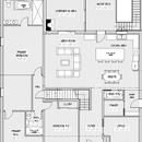
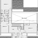
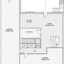
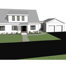
Excited to share our floor plan here and see what people think. The home is for 5 people, expecting it to be 6 w/ an elderly adult in ~5 years. Lot is sloped so we opted for a walk-out basement.
I’m still not convinced that 1.5 floors makes more sense than 2, but I have trouble envisioning a good way to set up the space if it’s 2 floors. Appreciate any and all feedback!
Worth noting this isn’t V1 – this is after revisions, just the first one I felt was close enough to ‘good’ to share here! Thing I know I want to adjust – wider shed dormer on the front so the two front-facing bedrooms have windows on that side of the house.
GBA Detail Library
A collection of one thousand construction details organized by climate and house part



Replies
It's..........OK. The general massing of the house is nice, but the main floor plan isn't great.
When you walk in the front door you're greeted by a rectangular hall that's blocked at the end by the bottom of the staircase. There's a small closet on the right but where would you put a chair or bench to let guests take off wet shoes - or a console table to put things down onto (if you put them on the right wall they will partially block the staircase)?
As you enter the main living space, the kitchen island is way too big and the space for the dining table is too small. People sitting at the dining table also have no view. Plus the kitchen island blocks a clear pathway to the back door.
The right side entry is nice but it needs more function than just a bench and some coat hooks, and nobody should have a powder room opening onto a main living space, especially directly across from the dining table. What guest is going to feel comfortable using it?
I would turn the kitchen island 90 degrees, put the powder room where the pantry is and the pantry where the powder room is and put the dining table between the kitchen and living room.
Probably the biggest problem is the master suite wing. Why do people design enormous master bedrooms? People put so many functions into the bedroom (sleeping, sitting room, walk-in closets, ensuite, etc that it's like they are building a house within a house). Plus, you have a beautiful view out the back of the house but you put the bathroom there - a room you'll be in for maybe one hour a day.
Put the ensuite bath and master closet where the sitting room now is and slide the bedroom up where the bath is now so you can look out at the view.
With the master closet out of the bottom left corner, you can now move the entire bedroom 2 and its bathroom to the left a bit and that will allow you more clearance between the bottom of the staircase and the office wall in the entry. Bedroom 2's bathroom will now benefit from having an exterior window.
The main floor powder room door should not open right to the dining table, I would reshuffle that area.
You'll also want at least a 2 piece (full bath even better) in the basement.
You mention elderly but I don't see an accessible bed/bad on the main floor, mobility issues happen quick and when you don't expect them. You'll want wider hallways and a curbless shower with enough space for a wheelchair.
Look at post #26 here, that is how I would build an air tight 1/2 story. No knee walls needed.
https://www.greenbuildingadvisor.com/article/maine-authors-publish-pretty-good-house
The idea is to essentially build a 2nd floor with short outside walls. This can also be done with standard platform framing if you have a roof structure (ie trusses or framed with structural ridge) that don't require a ceiling tie.
My wife has informed me that we are supposed to have a full bath in the basement - thank you for the reminder :P
Also, totally agree w/ you and another poster that the mudroom entrance needs to be adjusted somehow so that the powder room isn't immediately next to the dining table.
Q about your link - I believe that post talks about having balloon-framed kneewalls, am I getting that wrong?
david_solar,
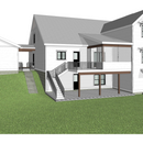
In terms of appearance the back needs work. Perhaps using one roof over the gable and covered outdoor space? The exterior stair is very awkward too.
Malcolm, I agree the render doesn't look amazing; it's the big reason why I initially was favoring two stories vs. 1.5 - awkward to have bits jutting out. The initial design had the screened-in room accessible from the master suite, and a deck wrapping all the way around the rest of the rear of the home. We changed that for multiple reasons, but it was more cohesive visually.
We are planning to slope the lot more so that it looks sort of like the one attached to this post - does that look any better to you?
david,
Yes- and good luck with your build!
agreed, that porch roof is no bueno. You may be able to fix the awkward stair by extending the deck to meet the second leg.
Agreed, we'll bring it up w/ the designer. Could you explain what you mean by extending the deck to meet the second leg?
Leave the stair where they are but extend the porch toward them so they feel more incorporated. Let me know if image makes sense (small red arrow)
So, make the deck wider, basically, right? The stairs would still need to turn, though, or do you think they would come off the rear of the deck?
Yes basically make deck wider but not full depth, stairs stay exactly where they are, keep turn in the stairs so now stairs go down on side of deck and not in the middle of air. I think your slope idea would look nice also just might be a bit more expensive.
Also I would make your stairs wider
I can’t quite tell what the connection from the great room is to the main bedroom suite.
If you are going to have someone ‘elderly’ loving there where is their space. Can you make the bathrooms for the bedroom more like ensuites which gives more privacy?
The bedrooms are large (at least for me) can. You get rid of the back and Jill bathroom (depending on who sleeps where).
In the main foyer why not create a mid room for people to shed their stuff as they walk in. If that’s not the ‘family entrance’ then consider how you will arrive and drop stuff off.
Of you have a lot of space around the house (eg not in suburbia - it sound like you aren’t) then consider the views - some of the bedrooms only have one window. Two sources of light feel better.
Another interesting thing for me (I have a small house) is the great room is in a huge volume - have you considered the impacts of heating and cooling that space. If you think 10 years down the line can you ‘close’ a part of the house if it’s not in use.
Lastly, if the office is a true offfice that will be used then I think with 6-8 people I’d try to create other spaces for reading / relaxing. For example If you trimmed a little from the bedroom for a small library / device / tv area then there’s another way to relax.
Ps I wish I was dong this - I’ve just gone through a house extension planning and it’s fun but stressful
Upon further reflection on your back entry, it looks like there is a blank, empty wall between the fridge and the back entry door. I would put a 30" long stub wall (a full height wall) in line with the powder room door wall and put floor to ceiling pantry cabinets on that section of wall.
A walk-in pantry wastes a lot of room - you have the depth of the shelves or counter but then you also need a 30-36" deep walking space to access the shelves inside the room. Pantry cabinets that are 24" deep and open right into the main space provide the same amount of storage without requiring a separate room.
With the pantry room gone, turn the powder room 90 degrees to the right so it opens into the now much larger back entrance mudroom. You can also add some shallow depth base cabinets for storage and some upper shelves if you want in the mudroom (and don't forget a broom closet! I don't know why, but everyone forgets to include a broom closet LOL).
And I hope you will turn that kitchen island 90 degrees and move the dining table to the middle of the great room like I first suggested - it will greatly improve the circulation pathways in the room and you'll have better views in all directions from the dining table.
Swap the pantry with the bath. More privacy for bathroom use that’s
easily accessible through entry, and better accessibility to pantry from the kitchen.
The beauty of designing a floorplan is get what you want. Unless it's more of an investment, to sell shortly after finishing, I don't see a problem of doing what you and your family want.
That said, I'm personally more in line with rockies63's suggestions. I don't love massive master suites, although I'm guessing you want a huge master to "get away" from others in the house. I also find the shower sizes to be overly large with relatively smaller vanities. All that tile space is going to be a chore to clean.
AC2000,
"The beauty of designing a floorplan is get what you want. Unless it's more of an investment, to sell shortly after finishing, I don't see a problem of doing what you and your family want."
I disagree. The field of design is premised on the belief that there are underlying principles, both practical and aesthetic, behind the decisions you make, not just doing what you want. Some floor plans are objectively better than others.
Malcolm,
As long as it's meets codes and bylaws, HOA, etc, people should be free to spend their money as they please. I seriously heed the advice of my architect, designer, builder and real estate agent, but at the end of the day, the final decisions are mine. I prefer rockies changes, but it's not my house. The only downside of personalized floor plans is limiting the potential future value on resale. I don't see a problem if david solar makes this conscious decision.
Edit to add: Malcolm, I find your advice here very insightful as well, and incorporate it in my decisions :-)
AC200,
I agree, although I don't think that's a prudent approach to take.
It's an interesting topic though. Most of the housing in North America is speculative rather than custom, so beyond market lead preferences there isn't really any input from the eventual owners. I wonder whether there is an appreciable difference (improvement?) between them and the nearby custom homes?
To me the big advantage of custom homes is that the changes can reflect their surroundings and relationship to the site, not the individual preferences of their owners - especially remembering that the average American family moves every five years.
As someone else mentioned swap the pantry and bathroom. Mainly, don't put the bathroom right there. It will be super awkward at least for guests when they get up and go to the bathroom 2' from the dining room table. You'll also hear everything with the current pocket door.
Please share updated plans when you have them. Thanks. I have no suggestions to make because everything I thought of has already been mentioned by others. Best of luck with your project!
Well! The danger for a home owner in posting their floor plans and asking everyone for their input is that you get lots of comments saying “move this wall here, turn this room 90 degrees, move this window over there, etc” and eventually it becomes a confusing jumble of words. So, since a picture is worth 1000 words, here are my ideas in visual form.
Starting in the upper left corner, I’ve moved the master bedroom here so that you get light on three sides and have a view out to the backyard. The next space down is a walk-in closet and the space below that is the master bathroom. I moved the master bath door to one end of the room and placed a double vanity counter directly across from the tub. The toilet is hidden behind a stub wall across from the door and I added a half-height wall at the shower end of the vanity that will match a half-height shower wall next to the tub (there will be glass up to the ceiling above both half-height walls). Bedroom #2 has been moved into the lower left corner so you can have windows on two exterior walls, there’s a walk-in closet and a larger bathroom with a window to the exterior.
The front hall has been widened with some of the stairs from the upper section moved to the section below the landing. You now have a much grander sight line into the main room and there’s room in the lower left corner of the entry hall for a couple of chairs and a console table. The office and hall closet remain the same.
In the main space the kitchen island has been turned 90 degrees and the dining table moved to the middle of the room. Double outswing French doors open onto the deck.
In the kitchen the space between the fridge and back entry door has two full height, 24” deep pantry cabinets. A stub wall (about 30” long) signifies where you leave the kitchen and enter the back mudroom. The powder room has been turned 90 degrees and the mudroom bench extended (although you could shorten it and add in a walled coat closet). In the upper left and right corners of the larger mudroom is space to put in a broom closet and a base cabinet and upper shelves (or maybe a recycling center).
On the south (?) side of the kitchen is a recess for 24” deep base cabinets (that could be a buffet or a computer station for the kids or a coffee station or wet bar). Then, as you walk through the doorway from the living room into the bedroom hall there is a one foot deep recess in the hall for built-in bookcases, or maybe shallow base cabinets and upper shelves (It’s nice to have something to look at in a hall, especially if it is visible from the main space).
Lastly, I hope you are planning on leaving the staircase open to the front hall and living room (you can close in the lower section to hide the stairs to the basement). You should consider using the long blank wall on the right side of the entry hall as a gallery wall and I would also consider built-in cabinetry on the long blank wall on the left side of the living room (and maybe integrate a gas fireplace)?
Of course, you can play around with room sizes, proportions and door and window placement and sizes but I hope you like my ideas. (and I only used 600 words).
I like the flow of this plan much more than the original. It's a good baseline to tweak for personal preferences. I would flip the pocket door for the powder room to the hall so guests don't have to walk through the mudroom to access it.
rockies63,
Good job!
We've already sent feedback to our designer, but I really like a lot of what you've done here. You definitely went above and beyond - thank you for taking so much time and consideration in putting this together! We're excited to see what the designer comes back with, but you've got a really good setup here and we'll probably share this with him regardless. Thank you again!
ACzoo: I have found that a bathroom door should never open out onto or be visible from a main living space. Imagine a guest at a party excusing themselves to use the powder room and knowing when they are done the moment they open the door everyone will be looking at them (peoples eyes naturally turn towards movement of any kind). Having the powder room door opening into the mudroom gives the user a lot more privacy and you are also much more likely to have the kids come in the back door and make a bee-line right to the bathroom than a guest anyway.
The one thing I might change in my suggested plan (depending on how they want to lay out the furniture) is moving the master bedroom's walk-in closet door from the upper wall to the wall facing into the bedroom hall. That would give them another blank wall for a dresser or maybe built-in bookcases or low cabinets and shelves.
As a practical matter it's going to be challenging to light the kitchen counters, island & table area. Think about closing off the kitchen area ceiling. & More windows in the living area!! We've started installing window walls in front of the sink; the person facing that wall always loves having a great view. It's a large room, but it will feel like a cave with only the slider, a single door and a small window. I'd add some onto the deck, and find a way to get in a single or double in that long outside cabinet wall.
I totally missed that the ceiling was vaulted over the kitchen and living room until yesterday. We're having the designer drop the ceiling down to 15" - still high, but 5+ feet lower than at the top, and it will allow us to deal with exactly what you called out - lighting.
We're also adding clerestory windows in that large space to bring in more natural light. I'll be putting the updated floor plans in here when I get them back.
With regards to lighting, bear in mind that as a light source is moved away from a surface that the amount of light hitting the surface is reduced by about 75%.
For example, if a light source is one foot above a countertop and you have 100 lumens hitting the countertop surface, if you increase the height of the light source above the countertop to two feet you only have 25 lumens hitting the surface, not 50 lumens. This makes lighting kitchen islands problematic, especially if there is a 15' ceiling.
One website I would definitely recommend you look at is David Warfell's Light Can Help You.
https://lightcanhelpyou.com/
The articles he has in his blog are extremely informative, especially the "Don't Do This" ones.
https://lightcanhelpyou.com/blog/
There are also a few videos on their Youtube channel.
https://www.youtube.com/@lightcanhelpyou9670
And some great interviews with him if you just look for David Warfell in the Youtube search box.
I've already talked once with David Warfell and have an appointment with him next week to discuss a lighting proposal :) I have no doubt he'll encourage us to drop the ceiling down to something like 12 feet so that pendants over the kitchen island can reach an appropriate height and not look nutso...
Met with the team today over Zoom, the presentation was great, they were friendly, and the pricing is a bit more than I hoped for, but I think we're still going to engage w/ them. The deliverables you get are pretty impressive and should go a long way towards ensuring that that the builder and electrician know what you want and how to make it happen.
david solar,
As long as people are still chipping in, I will too. Rockies 63 beat me to a similar redesign of the left side of the plan and others have already advised on a better way to serve visitor bathroom needs. I was going to point out that the scattered baths and laundry positions would entail extensive plumbing runs and very likely lots of holes through framing. Iam guessing that you have city sewer hookup would tend to gather the final drops at the front of the house in non-finished space. However, if doing septic on your lot then it would be best to check the drop rates on long runs to make sure you don't end up with a low hanging pipe crossing a finished room.
And not to be too harsh on plumbers, I have repaired too many crippled framing elements to have much faith in thoughtful layout coming from them without strict plans. HVAC running a close second. Regarding other framing considerations that are not clear from the plans, have you thought about tightening up some dimensions to better utilize sheet goods and to keep floor spans in less bouncy territory. The foot print seems to be about 48 x 49 feet, so I am imagining at least two support lines. The stair placement suggests floor joists would parallel the front of the house. No rule that all joists need to run one way, but the effects of changing joist directions on plumbing and heating needs can have strong effects on the bid costs.
Last notes, the stairs all have what seem like low risers unless your floor heights are greater than the usual 9'. It is not clear what your CZ is, but if it snows there, have you thought about the snow coming off the garage roof onto the walkway between house and garage?
Thanks for your thoughts!
- I'm aware of the size of the hot water envelope (https://www.energyvanguard.com/blog/how-i-got-faster-hot-water-at-the-tap/) and I've talked about it with the designer. We're not going to cluster all the bathrooms, the kitchen, and the laundry room close together as it doesn't work w/ the approach we're taking. To try and mitigate this, I am centrally locating the HPWH in the basement, and we'll use a good plumbing design (manifold maybe?) + appropriate pipe sizing to have good flow to as many fixtures as possible.
- I hadn't thought about tightening things up to reduce the need for extra materials, but it's a good idea. I'll talk with the builder about it.
- Ceilings are 9' on every floor
- CZ 5 (We're in CT, not near the water) so it'll snow. I have thought about snow coming off the garage roof, and I'm willing to shovel the walkway as the price of not having an attached garage :)
Just curious, how did you find and select your architectural designer?
The designer was recommended to us by the builder; they'd worked together before. We interviewed the designer on our own and looked at examples of his plans, and then visited two homes that were built off of his plans. We liked his work, and that he was young and on board with trying to design an efficient home.
I'm impressed that you already contacted David Warfell about your lighting plan.
I'm more curious to hear about your designer's reaction to our various suggestions.......
"Um, yea. We really liked your plans, but this guy on the internet says......oh, and one guy mocked up a floor plan showing us his ideas. What do you think?"
(I don't know why, but some designers don't react well to outside "help".......lol)
We knew from the beginning we were going to have to pay 3rd parties to get good design. We're not using an architect, and my builder is a knowledgeable guy, but he's knowledgeable about what most customers want. Most customers don't want exterior foam, most customers don't care about HVAC design, etc etc. I'm lucky that my designer and builder are both enthusiastic about building a PGH, even if I'm not calling it that with them.
I don't know why anyone would work with a designer that wasn't willing to collaborate on the plans. The whole point is that you're paying them to design what you want. Do we tell him we're crowd-sourcing feedback from strangers on the internet? Of course we don't. Do I get feedback where I'm able, discuss it with my wife, come up with an agreed-upon set of changes that we present to the builder and designer, and then agree upon a final set of changes between the four of us? Yes, and I think that's standard workflow with a designer and a builder. He's not precious about his design - it's not really his, it's legally ours, and the contract isn't complete until he delivers plans and specifications we sign off on. If we asked for, like, something ill-advised or dumb, he would tell us that it's not recommended. And when he misread our building envelope consultant's notes and thought we were asking for a non-code-compliant wall assembly he called it out.
“He's not precious about his design - it's not really his, it's legally ours,”
This is interesting and generally not the case. It usual that the designer retains IP of designs and allows owner to build design on specific site. This is usually for liability issues associated with building in site conditions that do not match the design. Is this not a part of your contract? If it is not you may suggest your designer adds it to future contracts.
I have had architectural and interior design training and (although not a licensed Architect) have worked within the building design field for over 35 years. Unfortunately, I have met many Architects that are not really there to build a house for you, they are merely creating something to puff up their own ego - hence they react very badly to "suggestions" from anyone, even the homeowner.
I always approach a floorplan from the point of view of circulation pathways. Can I move easily between rooms? Are there a lot of long, narrow hallways? Do I have to move through rooms to get to other rooms?
I also focus on "functional tasks". For example, I imagine that if I'm in a kitchen and about to bake a cake, I mentally go through where I need to stand for prep work, baking and cleanup, how far away are each of the ingredients, etc.
One series of books I would recommend (there are about 5 of them that you can get at most libraries) are by American Architect Sarah Susanka called "The Not So Big House". In them she walks you through a house layout, from what you want and need approaching the front door to how to lay out rooms and develop sight lines through those rooms. She also discusses an important aspect of interior space planning that is often overlooked - the vertical dimension (How to plan ceiling heights, include dropped ceilings and lowered soffits and plate rails).
I would recommend these books to anyone about to build a new home.
A second on the notion to sit and imagine your daily activities and move yourself about the space in your mind as much as you can muster. Everyone has differing needs and sense of personal space. Kitchens especially suffer from designer disease.
I will caution about the Susanka series being taken too much to heart. My wife and I visited a group of new builds that embraced her dictums if not her specific plans. I can't recall for sure if she directed the builds, so I don't want to pin anything on her. Anyway, the results were indeed very compact, beautiful, well appointed and devoid of any capacity to live in as a normal person. If one had no hobbies, no books, no pets and very well behaved and orderly children then they would be the picture perfect house we visited. We both felt that, for our particular lives at least, we would have to abandon all our interests and 90% of our possessions to fit the house. We would much rather have the house fit us, which is what we did.
Onslow: Sometimes the problem with design "movements" is that as the movement becomes more widely known and homeowners start asking for that particular style or those particular features, you get a lot of Architects and Interior Designers who paste the feature into their design without understanding the principles behind the feature.
This has happened throughout history, with people wanting a "Frank Lloyd Wright style house", or a "mid-century modern style house", etc. and you get the "look" but the proportions are all wrong or the rooms don't function well.
Probably the Sarah Susanka book I liked the best was her "Creating The Not So Big House".
https://www.amazon.ca/Creating-Not-So-Big-House/dp/1561586056
In it she goes through different design ideas and shows how rooms look with and without that feature. It's not necessarily a detail that you need to slavishly copy but it does show you options and possibilities to improve functionality for each room.
Updated floor plan from the designer, uploading here in a post. It's still not perfect but I think we're nearly there. Things we still need to address:
- Window placement
- Removing some space from the office to provide more room for benches/storage in the mudroom
- Dropping ceiling in kitchen from 15 feet down to 12 or 10 feet
- Swapping the location of the laundry and bathroom on the front of the 2nd story
- Opening the space under the shed dormer in BR 3 to the rest of the room
- Placement of wiring for EV charger in garage (should be on rear wall so useable by both vehicles)
I probably won't post any updates after this unless people are still interested - thank you again to the community for your input and assistance!
Long corridor in Master to MB is awkward. Put that guest bath on the outside wall and reduce the amount of corridor in the master.
Flip the laundry and bath on the 2nd floor. Very awkward to enter foyer directly from the bath; the laundry is better, and the bath serves the bedroom to the right so it should be closer to that bedroom
Otherwise HUGE improvement over the first plan.
Well, you know I'm going to comment LOL. But first a couple of questions.
What is that section of wall between the back door and the fridge for? If you're planning on putting a buffet/hutch there it's going to be awkward to use and it will make the passageway to the back door cramped. If nothing is going to go there then it's just another blank wall for dinner guests to look at.
The pantry is (let's say it) basically useless. If that's a standard 30" wide door at the end you're not going to be able to run shelves down the side of it (and still be able to walk by them) so all the shelves will be on the rear wall. Not a lot of storage for such a deep room.
I still think the master bedroom is far too big but the big problem is the second hallway to get from the bedroom to the Master bath. I'd say it's about 3'6" wide by about 22' long - so about 77 sq' of empty space (with another hall about the same size on the right side of the master closets and 2nd bathroom).
I don't like the layout of the Master bath - the vanities are wedged into the "leftover" spaces on the plan. It's nice that you don't see the toilet when you come into the room but windows above a soaker tub are a waste (especially if they look out into the front yard). No woman is ever going to feel comfortable climbing naked into or out of a tub that's in front of a window, and even if the window is a narrow strip up near the ceiling it's still basically useless.
I do like that you moved the closet in the front hall farther away from the front door but it's still cramped getting past the end of the stairs and into the main room and there's not a lot of space for a bench or console table without blocking the stairs..
I think the addition of the screen porch off the back is a mistake - it's going to make your kitchen really dark (actually, in the previous plan it also made the living room dark). If you must have a screen porch and you're determined to have the dining table where it is (along with that blank section of wall between the back door and the fridge) then I would put the screen porch on the other side of the right exterior kitchen wall and behind the garage. You could combine it with an enclosed breezeway between the house and garage or access it through the blank section of kitchen wall.
Lastly, I really prefer my ideas for your master bedroom/guest room side of the house (but hey, I'm biased) but I would really recommend that you do an empty space calculation on your floorplan. Lay out your furniture and then measure out the empty spaces around it and add it up. You're paying to build all that empty space, and while some circulation space is needed you may be surprised to discover how much there is in this plan (especially in that vast area between the kitchen island and the living room furniture).
This house is probably going to be the most expensive thing you're ever going pay for in your lives so don't rush into building a lot of space without making sure that it's as functional as possible.. Best of luck!
Revisited your previous design and I prefer it, too. Busy week - wife and I will connect on this over the weekend. The ongoing struggle is going to be convincing her to shrink the size of the primary BR; we spent a significant amount of money on a designer to make the huge BR in our existing home into something we really, really like, and she doesn't want to give it up. Keeping such a massive space on the first floor obviously means there's less room for everything else!
You've inspired me to been build a document to show the size of our current pantry / closets / hallway dimensions, compared against the builder's design, and then compared against a new proposed solution I'm throwing together in a CAD file. I'll measure our furniture, too, and drop that in - what a great suggestion, and one I can't believe I've overlooked until now.
Thank you again for taking so much of your time to explain your thoughts and preferences!
I have to agree with Rockies, the amount of circulation space on the left side is very awkward. It also leaves that second bathroom without a window. I would consider clumping the second bedroom and bath on the front wall.
This would allow you to shift that bedroom closet and you could move those stairs toward the front a little. I think that left side seems too narrow, I would consider widening it a little. This would allow for an easy fit of the master suite toward the back without it being super stretched out. It wouldn’t be a problem for the living space because as Rockies said there is a lot of wasted space in there. If you’re worried about overall sf just make it protrude to the rear less.
Another issue I have with that left side is the door to the finished basement, you can never have that left open in the current design. I would free up some wall space so it can sit open if needed or wanted.
That is also a good point about the light issue with the back screened porch (and I still don’t like that roof. You could change it to a gable and bring in substantially more light and most important make it not look like an addition.
I think at this point you have shifted stuff so much that you should take a step back and think about whether the major dimensions make sense. Sometimes a foot in one direction or another can make the difference of whether things fit or not.
Yeah, I agree that it's time to take a step back. I replied above to Rockies in more detail, but we're going to spend some real time this weekend thinking about things and doing it with full knowledge of the dimensions of our existing rooms and our furniture vs. where things could fit in a potential new floor plan.
The roof you don't like - you're referring to the roof on the screened room?
"I think at this point you have shifted stuff so much that you should take a step back and think about whether the major dimensions make sense. Sometimes a foot in one direction or another can make the difference of whether things fit or not."
I think this is a good suggestion. I'm not crazy about the changes as they seem a bit forced to address specific issues without taking a holistic view of the flow and function. The kitchen island and dinette location seemed forced and may be cramped in real life usage. The new requirement to drop the kitchen ceiling will impact your vaulted ceiling in the great room and you will have to see how the transition from high to low works and how it looks.
I've been through your process recently and am currently in construction. I know how exciting and emotional this can be. It may be worthwhile for you and your family to step back and look at your priorities, such as a large master suite and anchoring your design along with a few other must haves and sketch a fresh layout rather than trying to adjust the existing one.
I'm also a bit surprised that your designer did not flag these flow issues and kitchen ceiling height sooner in the process and at a minimum raise them as concerns. Personally, I favor separating the selection of designer/architect from the builder and choosing an architect first whose natural style and tendencies fit your lifestyle and tastes. You can use a your builder as a sounding board for impact on budget and construction techniques. I also think the design is not something that one should try to skimp on (within reason of course). I've talked to many people who wanted to save money and hire a budget architect only to spend many more times the difference on a fancy counter top. The designs suffer for it.
AC200,
Sound advice.
Well, thank you for your kind words regarding my suggested floorplan ideas. It can be hard sometimes to try and visualize a finished space from just a floorplan, especially if you don’t do this sort of work for a living. If you do decide to go through with some (or all) of my suggestions, I would just show your designer the plan I posted and say you did it. :)
In truth, all I did was open up your original floorplan image in Microsoft office, made several copies of it and then cropped each of the copies down to an individual room and then overlaid each one on the main image. Once I was happy with the design I took a final screenshot and then opened that image in Paint and erased any errant lines. Basically, all the rooms are pretty much the same size as they were in the original plan, just in different places.
As to your wife’s concern that the bedroom will be too small I thought back to the Master bedroom that most of our parents would have had. It would typically have been about 10 x 12 feet with just enough room for a Queen sized bed, two night stands, a closet that held both of their clothes, and if there was enough wall space then you could add in a chest of drawers for dad and a dresser and mirror for mom.
People today, however, want a lot more features in the Master bedroom, but sometimes there can be so many added features that you’ve effectively built a “house within a house”. I mean, if you plan on spending all your time in a full sized sitting room attached to the bedroom space what do you need the livingroom for?
For the size of Master bedroom I’ve suggested you’ll still have plenty of room for a King sized bed, night stands, a chest of drawers and a dresser and mirror but if you also want a space to relax (without having to add an entire sitting room) I would suggest a pair of built-in cabinets on either side of the window on the upper wall and put a two foot deep window seat between them. Add in a nearby chaise lounge, a side table and a reading lamp and you’ll have a wonderful space to either spend an afternoon reading by the window or lounging in the evening before bed.
I did like another persons suggestion to widen the master bedroom wing a bit – but no more than two feet (take the width out of the main space). In my plan add one foot to the width of the master bath (in front of the vanity) and master closet and the other foot of width to the hall serving the master bedroom and guest room (and please keep the one foot deep built-in bookcases along the side of that hall).
As to the master bath layout, if you go with my plan you’re still going to have a window over the tub (which I’m not thrilled about) but at least it will face onto the side of the house rather than the front. A large window over a tub is problematic because you’ll never climb into the tub to open it and when you’re using the tub you’ll feel “exposed” (if you can look out at the view when you’re in the tub then people can look in as well). Probably the best solution is a special kind of window that has a gel between the two panes of glass. You hit a button and an electrical charge goes through the gel and makes it opaque and when you stop the electricity (only a very small amount is needed) the window goes clear. It’s a bit pricey but your only other window options are rain glass (so no view) or motorized privacy blinds.
Lastly, about that screen porch. I’m not sure what your climate is like all year round, or how bad the insects get in the summer but I do know that having it attached to the back of the house is going to make your main living spaces dark. Does it have to be attached to the house? Could you place it nearby so you can use it as a pavilion? It wouldn’t even have to be on this level and depending on what you have planned for landscaping or outdoor features (like a hot tub or a fire pit) you could combine its function with that of a pool house or a spa getaway.
In any case, I’ve enjoyed working on this plan and I hope you, your wife and your designer can come to an agreement about what to build. Let me know if you have any questions :)
A couple folks have commented on the master bath. You might find "lesson 5: compact, five-piece master" from this article a useful inspiration: https://www.boardandvellum.com/blog/common-bathroom-floor-plans-rules-of-thumb/
I'm a big fan of that article in general when thinking about bathrooms. It's not the be-all end-all of bathroom design or anything, but there are a lot of nice ideas in there.
Since you mentioned an elderly person as one of the occupants, regarding designing for aging in place, I think this checklist is a really great place to start: https://www.finehomebuilding.com/2018/11/03/3-tiered-checklist-aging-place
(And a direct link to the age-in-place pdf https://www.finehomebuilding.com/membership/pdf/219425/H281CO_AIPchecklist.pdf )
Go through it and decide for each item whether or not you want to include. Then go through your design and make sure you are including the accessibility features that you have decided are important to you!