Opinions on this Floor Plan
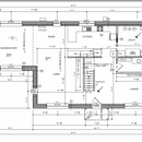
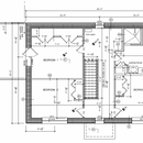
This is mainly for entertainment purposes, since the house is built. I didn’t discover this site until well too late to make any changes, otherwise I would have asked for feedback in advance. I’m curious as to what mistakes people think we made, compared to mistakes I think we made.
Aside from entertainment, it can be illustrative to others looking for floor plan ideas.
The house is slab on grade, oriented top due north.
GBA Detail Library
A collection of one thousand construction details organized by climate and house part



Replies
Trevor,
It looks really efficient. How does it feel from a livability standpoint? Do you ever wish for a bigger entry, maybe with an airlock? And I guess your energy model pushed for minimal windows. If you had it to do over, would you put in more or bigger windows?
Solid. It's not too far off from the old four-square Sears homes, just a couple extra feet each dimension. The main level breaks that mold a bit with the "conservatory" bump out. I'm sure that's the best naturally lit space (where I'd spend the most time!)
Minor things: for a shared second level bath I like to compartmentalize especially with no master bath. Dining room seems like a circulation path to the better-defined spaces.
I'd take this house over the one I live in currently.
It is challenging to critique plans without knowing more about what is important to you and your family.
Generally speaking, I really like your floor plan. I like how the bathrooms and and utility room are all in the same vicinity for increased efficiency. I also like how your rooms with less windows (utility room/baths/kitchen) are on the north wall. Bravo!
Some elements that I might have re-considered (personal preferences):
-There are three different 'living' areas. Would one have sufficed? The lounge strikes me as a traditional room that requires furniture but is never used. :-)
-By putting the stairwell in the middle of the house, you are forced to add the hallway on one side of it on both floors. This takes up additional square footage.
- Given the total square footage, I feel that you could have easily included a bedroom/bath downstairs. (This adds flexibility for future residents/family with mobility challenges.)
- Also given the square footage, I feel like a more efficient design could have accommodated a guest bathroom and a walk-in closet for the primary bedroom on 2nd floor.
-The kitchen reduces usable cabinet space by having two corners on the North wall. Also, including three entrances to the kitchen cuts down on usable kitchen area.
-Ideally, it would have been great to relocate the plumbing to the shower on the exterior wall. Always nice to keep plumbing on interior walls or at least within a service cavity (which you may already have). Love the 2x6 plumbing wall on the first floor though!
-Finally, I am trying to think through how you laid out your floor joists. Is there a steel beam between the dining room and Conservatory? Simple, efficient layouts can make floor framing much easier and lower embodied energy. Same for roof trusses: If the house were slightly narrower and your roof pitch was 8/12 or lower, you might be able to omit piggy-back trusses. (Wide-Load laws may be different in Canada) This can save on labor and materials.
Trevor,
I hope when you have received sufficient comment you will tell us how you find living there, and the the things you might have done differently in retrospect.
It looks like a good livable plan. I probably would have moved the closets in the master bedroom from the exterior wall to the one opposite. I generally try and avoid having the headboard share a wall with another bedroom.
I would describe the house as "fine". My wife likes it more than I do.
My biggest regrets or things I would change are:
-ditch the second floor and just make it a bigger bungalow
-have a separate (and bigger) utility/storage room. Having that room as an entrance just tends to junk it up, and it can't really be used for much. Based on where the parking pad is, that is the most used entrance by a wide margin.
-replace the west side door/sidelight combinations with just wider glazed single doors
-ducted minisplit from the start instead of in-floor hydronic (which is now effectively retired; I guess you could call it a back-up heat system, but we already have back-up heat so now we have triple redundancy)
-tilt and turn windows instead of casement
-
Steve,
Overall it's very livable. In the original plan that we used as a jumping off point, there was a small bump-out for the front door. We eliminated that for simplicity. I wouldn't mind having that; never once thought about having an airlock for it though. We certainly considered energy efficiency when placing and sizing windows, but I'd say the amount of glazing is actually above what would be typical. (All but the front door are fully glazed too). The only one I sometimes wish was there was one on the east wall of bedroom 3, as this would allow a view of the driveway. The house is naturally lit very well during the day, better than any house I've ever been in before.
Jason,
The design we started with had a true conservatory in that place, outside the thermal envelope. It was an Irish design.
Rick,
I wanted to have different areas where people could go if they were doing different things. The stairway kind of serves a purpose of dividing the floor up, though I can see how having it along a way would save some floor space. That "hallway" to the east of it gets used as a play area by the kids.
As for the bedroom/bathroom downstairs, in retrospect I would have put everything on the main floor. As it was, I had to argue with my wife just to get the two piece bathroom downstairs. She grew up in a house with one bathroom. I put my foot down and insisted.
We have service cavities, so there's nothing in any of the exterior walls.
The floor joists are 16" web trusses on 12" centres on the main part of the house, and 12" trusses above the conservatory. I think there's a 12" LSL spanning the conservatory entrance as well. The roof trusses were site built from scratch. This was a change in the plans because of some kind of mix up on the ordering of the trusses. I don't think they were ever going to be piggyback trusses though.