Image Credit: Jennifer Corson
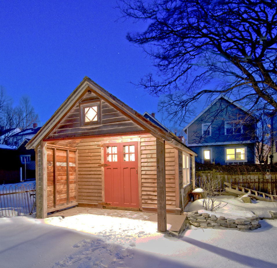
Image Credit: Jennifer Corson **Naturally needs no finish.** The cedar clapboards held up for years with no paint, so leaving them that way seemed the right thing to do. A dry-laid stone patio complements the wood and is an inviting place to sit in nicer weather.
Image Credit: Jennifer Corson **Low-tech, low-cost windows.** Some of the windows are original to the garage, and some we salvaged from other buildings. Custom-made interior storm windows help make up for the old windows' lack of insulated glass.
Image Credit: Jennifer Corson **Inviting, inside and out.** With an integrated stone porch leading into an adjacent patio, the small office seamlessly blends into the comfortable garden.
Image Credit: Jennifer Corson **Getting an early start.** Here's the garage before any major renovation. It already has the new cedar shingle roof, and garden beds already cover the original driveway.
Image Credit: Jennifer Corson Image Credit: Jennifer Corson
Locally milled and salvaged materials and a focus on preservation and simplicity make this small remodel a big success
When we purchased our circa-1896 farmhouse in 1994, one of the main attractions was the old garage. We quickly replaced its failing asphalt roof with new cedar shingles in 1995, but as much as we liked it, the garage remained a somewhat forgotten backdrop to our yard until we were forced to address structural issues in early 2008.
Solve the big problems first
The impetus of this project was a crumbling concrete slab and corresponding splayed walls. We jacked up the entire building to remove the rubble and form the new foundation. Luckily, the rest of the garage was in good enough shape to survive the jacking relatively intact. In fact, we hardly touched the cedar exterior—which likely had not seen paint for over 40 years—and left it unfinished.
The initial approach was to “save” the garage. Once we had emptied it out in preparation for the renovation, we realized that it was just a place to store nothing of value. At the same time, we were outgrowing our architecture firm’s office around the corner, so this seemed like a perfect opportunity to solve more than one problem. We purchased a small garden tool bin to store the push-reel mower, rakes, and shovels, gave the rest of the contents to the recycling depot, donation shops, and neighbors, and began planning our new workspace.
Design Approach: Sweat the Details, But Keep It Simple
At Solterre Design
, we enjoy getting into the details of a project but are generally minimalists. The original simplicity of the small garage and our conservation-minded design philosophy guided many of our decisions. With salvaged doors and windows, locally milled pine boards, and an acid-etched concrete slab, most of the new interior finishes are merely refinements of the original interior surfaces. The only modern details that stand out are the smooth plywood ceiling panels and the rich color of the dyed floor.
Comfort Without Much Effort
We had to decide whether or not to insulate the new slab. Comfort was a key concern, so we placed 2 in. of XPS under the new concrete and installed radiant heat tubing; these will soon be fed by a pair of flat-plate solar collectors that have been knocking around our architectural salvage company, Renovator’s Resource
. There will be no heat storage tank, just the volume of the collectors and the tubing in the slab; a simple, 50W, PV-powered pump will circulate a glycol solution through the system. An electric baseboard will provide backup heat until we have the solar hydronic system worked out, and it will also pick up the slack in colder months when solar isn’t enough.
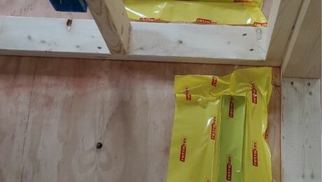
To help keep the heat in, we sprayed Icynene between all of the rough-sawn 2×4 studs and rafters. We painted on a latex vapor retarder before applying the finish boards and plywood. The 24-in. spacing of the old framing was a good fit with the 4-ft. sheets of plywood we chose for the ceiling, requiring little cutting or additional blocking.
The salvaged diamond-muntin windows are not at all energy efficient, but our aesthetic and budget overruled a more modern option. We balanced this choice with a homemade second skin—basically, interior storm windows made from acrylic sheeting, insulated compression tape, and rare-earth magnets.
Reasons and Means for Working Efficiently
Because of the project’s modest size and because it ultimately became a business need and not just a personal one, it made sense to swiftly complete it in a matter of months. To make things easier, we enlisted people that we had worked closely with in the past—Michael Gorman and Martin Philbey, trusted carpenters who have worked with me at Renovator’s Resource.
Weekly Newsletter
Get building science and energy efficiency advice, plus special offers, in your inbox.
Lessons Learned
Be careful, follow your intuition, and enjoy
This project, although very small, became a research project. It was the first time our crew had acid-etched a slab. Unfortunately, the water drops Icynene spray created multiple sealed water marks on the new concrete, preventing the acid stain to etch those spots. It is okay for our own small office, but we would have been very disappointed had this happened on a client’s project.
It was also the smallest renovation our crew had ever attempted. The simplicity of the space was the guide on how to finish it, and matching the new walls to the existing ones proved quite easy. The success of the project certainly supported the value of a hands-on, minimalist design approach.
The Taj (or "Garage Mahal," as we affectionately call it) has become our getaway. Any challenging work tasks—like writing, brainstorming, and quiet contemplation—occur away from our main Solterre office, just two blocks away, in the Taj. We have put a sign on the wall—WELIKEIT—that I had purchased at a local auction. I always planned to research its meaning; it’s likely a Mikma’q (a local First Nations’ group) name. Though on one quiet evening it came to me: “We Like It.” And we do.
It is quite likely that our kids will rally to have it as their own getaway in a few years. We may have a battle on our hands then, as it is a special place.
General Specs and Team
| Location: | Halifax, NS |
|---|---|
| Living Space: | 150 |
| Additional Notes: | **Architect:** Jennifer Corson and Keith Robertson, [Solterre Design](http://solterre.com/philosophy.php)
**Builder:** Michael Gorman and Martin Philbey
## Site ##
|


0 Comments
Log in or create an account to post a comment.
Sign up Log in