Image Credit: Warren Bond Photography
Image Credit: Carl Seville This photo shows the rear of the home prior to the retrofit.
Image Credit: Carl Seville The new back of the home. Lots of new space without much of a new footprint.
Image Credit: Warren Bond Photography This photo is the kitchen before, with the windows looking out to the back yard.
Image Credit: Carl Seville This image is of the new kitchen, expanded into the former breakfast area and looking back toward the interior of the home.
Image Credit: Warren Bond Photography Photo of the original attic, looking past the living room chimney towards the side of the house with the driveway.
Image Credit: Carl Seville This photo shows the new rear upstairs bedroom (formerly simply the attic), looking into the back yard on the corner with the driveway.
Image Credit: Carl Seville This photo shows the unfinished master bedroom sidewall with the fireplace (completely inside conditioned space, note).
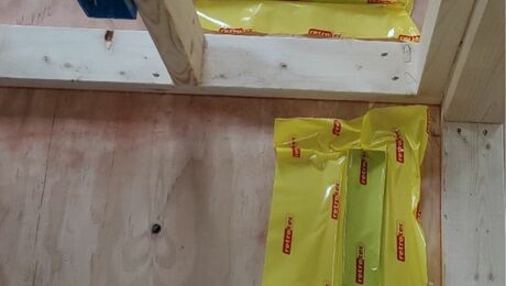
Image Credit: Carl Seville Photo: Window installation with the housewrap and window flashing integrated and properly weatherlapped.
Image Credit: Carl Seville Photo: Detached garage, for the soundest approach to keeping vehicles and people separate unless they are traveling together.
Image Credit: Carl Seville Photo: The Packer 750 mobile jobsite grinder in action, capable of grinding everything from brick and block to wood, drywall and asphalt roofing shingles.
Image Credit: Carl Seville Clean wood waste ground on site can be used for erosion control or as mulch.
Image Credit: Carl Seville Photo: A mixture of roof slate and brick waste have been ground on site for use as the driveway base.
Image Credit: Carl Seville This image shows the existing first floor plan for the 2400 square foot existing home. The front of the home is to the right with the driveway running along the top of the image.
Image Credit: Carl Seville This is the first floor plan for the newly configured space with just the 150 square feet of expanded footprint. Note the reconfigured areas are in red.
Image Credit: Carl Seville This image shows the floor plan for the 2nd floor, formerly the rough attic. The front of the house is along the right hand side of this plan with the driveway running along the top of the image.
Image Credit: Carl Seville
Along with a slew of awards and nicely-done integration of green building and historic preservation, this custom retrofit has some great lessons learned.
Honoring an amazing 100-year context
This renovation project took place in the Druid Hills Historic District in Atlanta, Georgia, and entailed the expansion and major renovation of the entire structure. Druid Hills was designed by Frederick Law Olmsted, designer of Central Park in New York City). The neighborhood was the location for the filming of “Driving Miss Daisy” with Jessica Tandy and Morgan Freeman. The house was built in 1918 and had to go through a historic preservation committee approval before construction began. Shortly before construction was scheduled to start, a 120-year-old oak tree fell and damaged the rear of the house, including many of the clay roof tiles. All the salvageable clay tiles were reused, along with several thousand additional vintage tiles purchased that matched the house perfectly. We thought the existing buff-colored brick on the house was going to be hard to match, so the original plan was to stain the new brick to match the existing. But when delivered, the new brick was a perfect match for the original brick.
Efficiency by design
One core concept of the project was to reuse as much of the existing structure as possible while expanding the house considerably. Starting with three bedrooms and two baths, the goal was to expand to five bedrooms, including a large master suite, and to redo the kitchen in such a way that a state-of-the-art family room could be added. The solution was to convert the entire attic to living space, adding just three dormers, and to add just a very small addition to reconfigure the kitchen into the new family room. Except for the small addition, the exterior wall surface on the first floor remains unchanged. A screened porch, a new garage, and completely upgraded systems and equipment rounded out this project.
Efficiency in materials
One key job site practice employed throughout the project was extensive reuse and recycling (scroll far right). All the unpainted wood from the site was reused on other projects or ground into mulch and used for erosion control. Extra bricks and broken roof tile were ground on site and used as gravel below the driveway. The concrete removed from the drive was hauled to a recycling plant and ground into base for underneath the rest of the new driveway. Most of the cabinets, counters, plumbing, and electrical fixtures were recycled through individuals and organizations. Job site recycling included all drink containers and corrugated cardboard.
Low-VOC paint and floor finishes, and MDF and finger-jointed wood products were used throughout the home’s interior. And despite its environmental stigma, PVC was selected for the exterior trim based on durability and moisture resistance.
Energy efficiency
Our focus on materials certainly did not come at the expense of energy efficiency. We dropped the air infiltration rate by two-thirds. By my best estimates using 4-month before and after data (including adjustments for square footage, heating degree days, and cooling degree days), our work reduced heat and hot water by 68% and cooling, lighting, and plug loads by 54%.
Weekly Newsletter
Get building science and energy efficiency advice, plus special offers, in your inbox.
Lessons Learned
As the Green Building Curmudgeon, I am exceptionally good at ferreting out lessons learned.
Sound transmission: Sure wish we had done more acoustical separation between the first and second floors while we had things pretty much opened up. We went back and insulated the knee walls after the fact, but that did not help as much as we had hoped.
West glazing: We completed the remodeling design before the 100-year-old oak tree fell in the back yard, exposing two sets of west-facing windows. We should have designed shading for those windows on the fly.
Hot water: We should have taken into account hot-water distribution in laying out rooms and actual runs because the lack of structured plumbing means lots of long piping runs and demand pumps. This lack of design included the function of both tankless water heaters.
First floor tankless water heater: We could not locate it near the bathroom as planned because we could not vent it there. So it ended up on the opposite side of the basement, requiring yet another on-demand pump.
2nd floor tankless water heater: This was designed with ½” return loop, but when the on-demand pump was installed, there was too much resistance on the return line. We had to relocate the pump to another part of house, and then a jump between the ¾” hot and cold lines worked fine.
Too darn big: We kept the formal living room, dining room, and a small den, all of which are basically unused almost all the time. We could have and should have pulled more existing space into the reconfiguration and brought the total square footage of the project down a lot.
Those bloody occupants! I walked upstairs once on a nice day (about 68 degrees) and the hallway was about 90 degrees. I went into my stepson’s room, where the thermostat for that part of the house was located, and he had the windows wide open and the heat set to about 72, causing the heat to run continuously just to keep up in his room. You can't get new kids, so we need systems that give feedback to outsmart our families.
General Specs and Team
| Location: | Atlanta, GA |
|---|---|
| Bedrooms: | 5 |
| Bathrooms: | 4.5 |
| Living Space: | 4700 |
| Cost: | 100 |
Builder: Seville Consulting Architect: Jimmy Carrion
Construction
- Foundation: CMU (new); brick (existing)
- Above-Grade Walls: 2x4, R-13 Icynene spray foam, Dens Glas Silver sheathing, Brick veneer
- Roof: Unvented, R-22 Icynene spray foam, reused antique clay tile
- Garage: Detached
Energy
- CFLs in all recessed lights
- fan timers, occupancy sensors
- daylighting with skylights and interior windows
Energy Specs
- Furnace: Amana 94% AFUE Gas Forced Air
- AC: Amana 14 SEER
- Windows: A & H Windows Insulated argon filled, U=.26, SHGC = .35
- Air tightness: ACH ("natural" Before) = .76; ACH ("natural" After) = .26
Water Efficiency
- Sterling (Kohler) dual flush toilets
- on-demand hot water recirculation
- no irrigation system
Indoor Air Quality
Green Materials and Resource Efficiency
- reused clay roof tiles
- reused existing brick
- recycled concrete & damaged brick
- advanced framing throughout
- engineered framing members
Certification
- HERS score: 72 (old system)
- EarthCraft House certification
- 2005 Southern Building Show EarthCraft Renovation Showcase Project
- 2006 NAHB Green Remodeling Project Award
- 2007 McGraw-Hill Smart Market Report
- 2007 Remodeling Magazine Honorable Mention for Green Remodeling
- Homes Across America Integrated Design Award
- 2006 Environmental Design and Construction Magazine Excellence in Design Award Finalist


One Comment
BEAUTIFUL!!
The home looks absolutely gorgeous....And I love the fact that you used the grinder so you could reuse a bunch of the waste!! Now that's thinking!! Looks like you guys do some quality work....That kitchen turned amazing as well...Keep up the good work!!
Log in or create an account to post a comment.
Sign up Log in