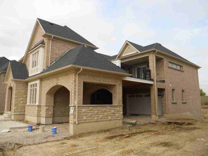
Image Credit: All photos: Greg Labbe
There’s a reason that every high-performance car is sleek and compact in shape; sleekness improves performance. The same principle applies to centuries-old sculptures that keep their features and endure centuries of weathering and the test of time: keep the shape simple.
Unfortunately, the current trend is to build large homes that have poorly designed floor spaces. The physical shape of these origami-like buildings impacts our lives, our comfort, and our energy bills.
Finding beauty in simplicity
Homes are functional art. A home has to be durable, comfortable, and (ideally) close to maintenance-free.
Humans are attracted to beautiful things. When we distill the features of a home down to their essence, the result is a simple design that meets our ergonomic needs.
Take furniture, for example. Some artisanal furniture shops sell great examples of functional objects that are honest and essential, creating lines of furniture like Danish teak dining room sets. Not all furniture is loved, but pieces that do evoke caring are always welcomed by the next generation. Good design transcends time and fashion.
This concept is at the core of the “Not So Big House” series of books written by Sarah Susanka, who urges us to spend not on large size and complexity, but on good design with thoughtful detailing.
Since many Europeans pay phenomenally high utility prices, they have been building super-efficient homes with simple shapes for 20 years now. The movement has even inspired Twitter hash tags, including #BoxyButBeautiful.
Complexity ≠Efficiency
Let’s get one thing straight: complexity works against efficiency in many ways. In many cases, things get missed in the design that have to be solved in the construction phase. Or worse: errors just drywalled and painted over.
Right from the start, complexity requires more planning and more explaining. And once construction starts, framers have to do more cobbling. Inspectors miss things, because there’s so much to look at.
Yes, the detailing for this type of building can be done properly, but it’s often overlooked. Have a look for yourself at how varied and complex the features of an origami home can be!
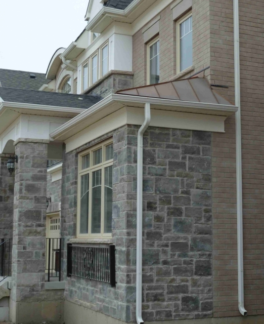
This lovely tin-roofed side attic is on the main floor. It will get short shrift on insulation detailing. The brick of the second floor wall is supported by a steel I-beam that bears on two columns. With no attic hatch to provide the access for quality control, what’s the incentive to detail everything right?
See the video below for a look inside.
Let’s be frank and call it what it is: a side attic with a huge steel beam running through it. These areas are rarely insulated and air sealed properly, because the work is difficult to do well.
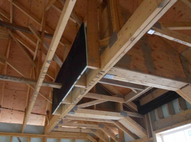
What’s this? We’re looking up toward the second-floor ceiling, and this is a dead space. It’s 2 square feet of floor space that could have been added to a closet. This is what happens when you have room to squander: you get lazy in the design and layout.
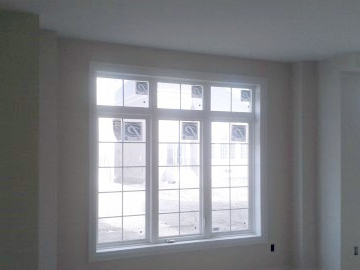
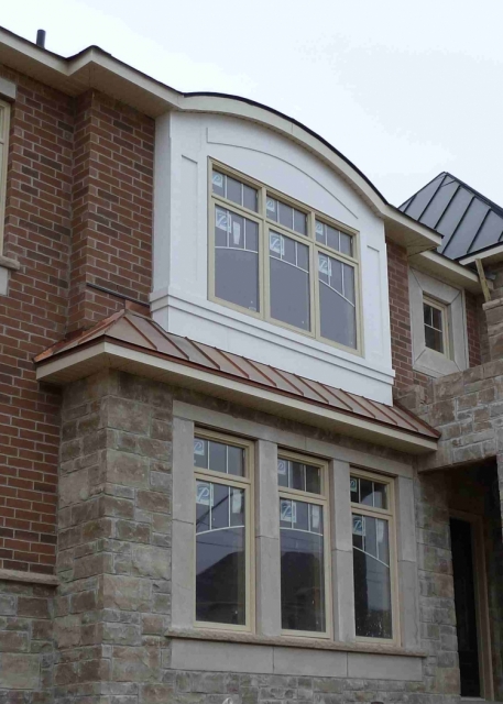
The origami wouldn’t be complete without fetishizing the dormer. You can see the extent a framer needs to go through for that “cathedral look” inside a nameless second floor window.
Large houses have more point loads and therefore more columns and built-up beams along outside walls. Again, these require careful planning and detailing to avoid thermal bridges.
A house with a huge footprint has point loads and beams that disrupt HVAC runs. Here we see HVAC art, but what it spells is discomfort. This problem should have been addressed at the design stage.
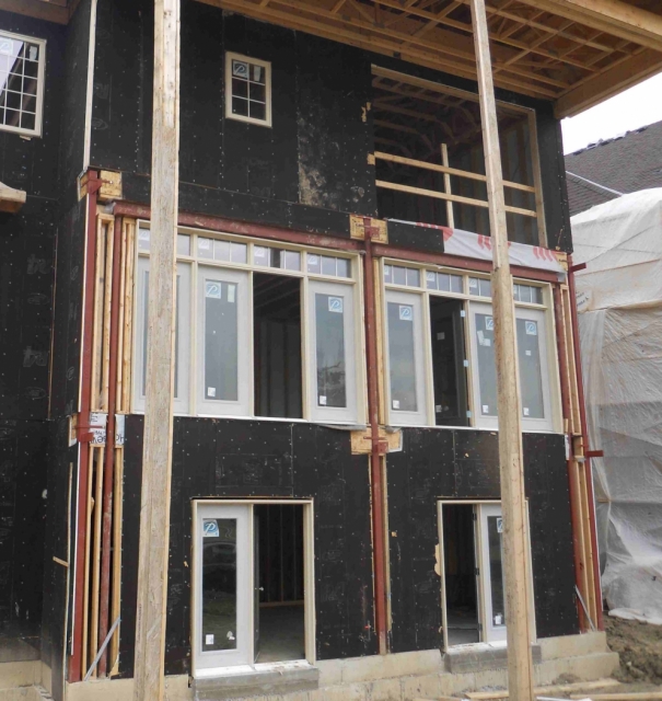
The thermal bridging that will take place at each powder-coated steel column is significant. Unless the builder uses a good insulated sheathing and details the connections properly, this house will be comfort-challenged.
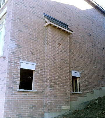
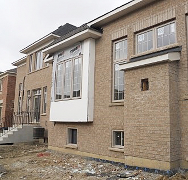
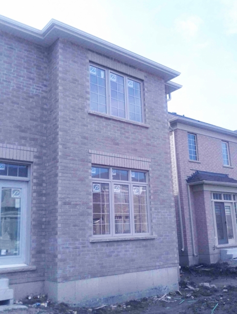
This expensive bump-out in the wall is for a fireplace gas insert. It’s unnecessary; it could have been bumped in. But we like our interiors to have clean lines: no bulkheads or bumped-in fireplaces! Check below to see all that’s gone into making this happen. With all the extra framing and the mini roofed attic, it’s a lot of detailing.
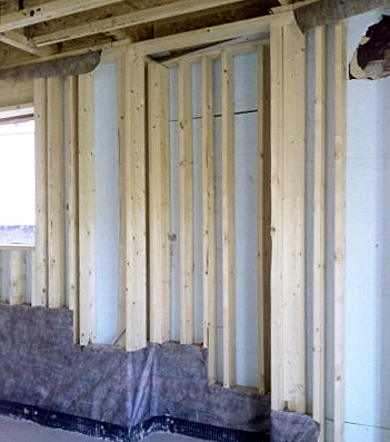
Here’s what the bump-out in the photo above looks like in the basement: lots of framing and a shallow cubby that serves little purpose.
The kitchen sink bump-out and the fireplace bump-out: two for one!
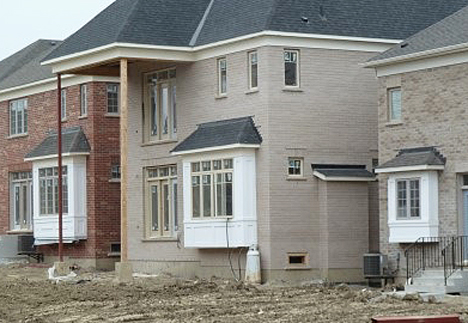
It’s official: everyone needs a bump-out!
The following three pictures provide a sequence showing what can go wrong with a bump-out. Of course, it’s expensive to add four more corners to the building, both from a construction perspective and an energy-efficiency perspective.
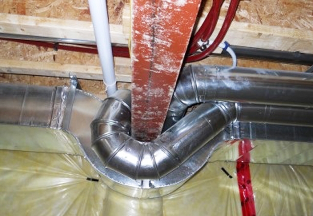
This is what the bump-out looks like in the basement. We see four ducts, with one pair supplying each floor above grade level. Notice that the ducts all have to bend around the header and that each 45° elbow introduces 10 feet of equivalent duct resistance to the air flow.
On the main floor, we see a box in each corner for ducts that run to the second floor. Putting a duct against an outside wall is not good design practice; it’s even worse in an outside corner.
Here’s the second floor, where the ducts turn in and come up through the floor. The conditioned air will have a lower pressure and temperature by the time it completes its journey upstairs.
As Passivhaus builder Ed Marion likes to say about this one, “It has bump-outs on its bump-outs!”
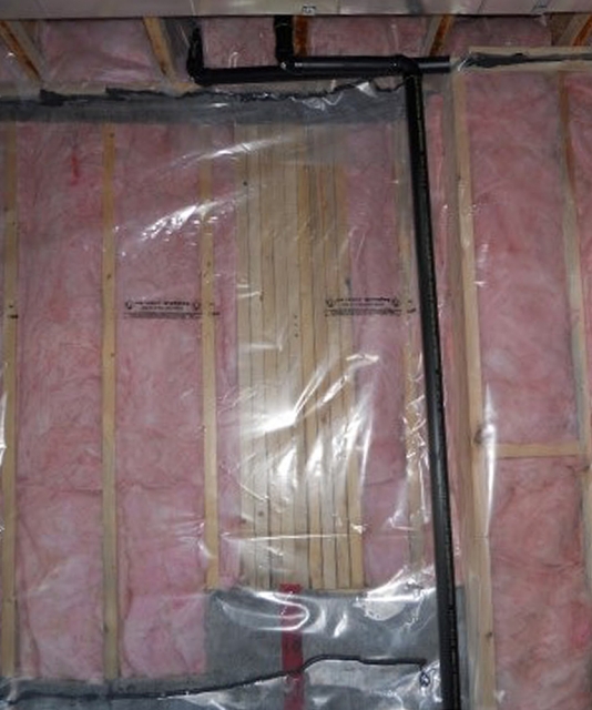
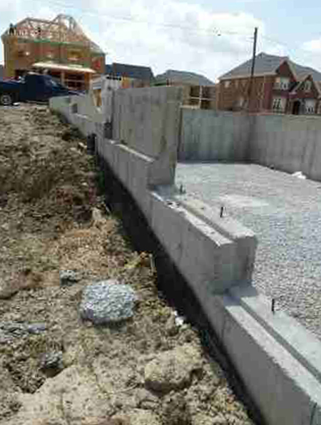
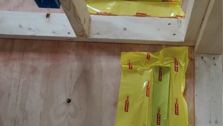
Detailing for a good air seal along this stepped foundation wall isn’t impossible, but it takes some focus.
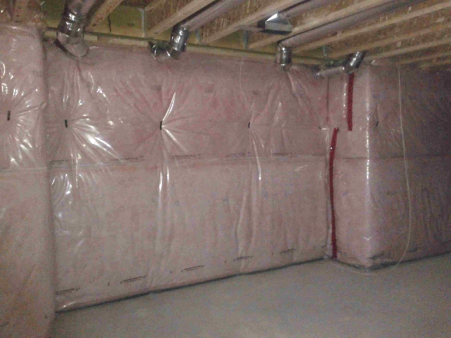
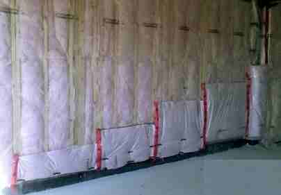
Here’s what a stepped wall looks from the inside. The pony wall to foundation wall transition is never elegant, especially when it’s covered by roll insulation.
Bonus rooms above garages are responsible for a constant stream of complaints. This type of room is more exposed than other rooms in the house and is distant from the furnace.
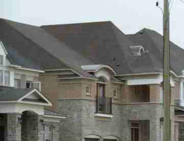
With the large catchment area of this roof emptying out onto one small length of gutter, it’s just a matter of time before the house suffers an ice dam.
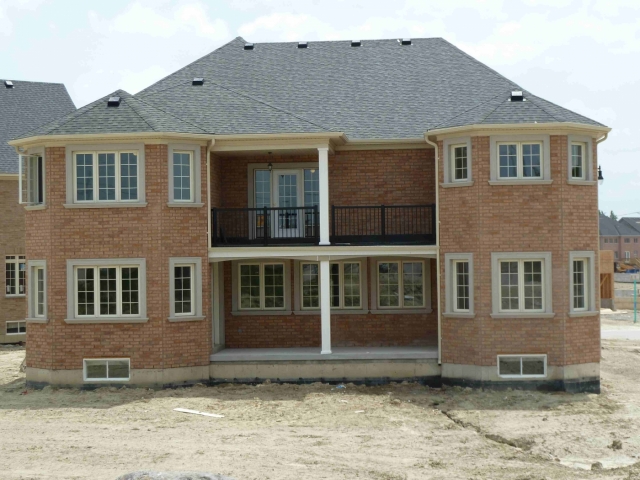
Like the house above, the large catchment area of this roof empties out onto one small length of gutter.
Greg Labbé is co-owner of BlueGreen Consulting Group, a high-performance home consulting firm that works with architects, builders, and homeowners to optimize the energy performance of new and existing homes through detailed energy modeling and site testing.
Weekly Newsletter
Get building science and energy efficiency advice, plus special offers, in your inbox.








12 Comments
A house or a home
Yikes! Some pretty serious and sad examples of what not to do. But only for the owner-built and the odd, conscious designer (may I stress, "odd"). We call these over-priced houses all in a row, modern "tract housing".
What irony. Most of these houses will be resold in 3 to 10 years due to divorce, education, employment changes, financial problems, illness, death, inheritance and wealth increase, moving on up; etc. Many are purchased for rental income where operating costs (and savings) go to the tenant. The purpose of buying a house these days is the same argument being made over and over again about the ROI on energy solutions, just applied to a different asset base: the whole house (vs an isolated asset like a heating system and a segregated routine cost like energy).
The efficiency of these houses is of no concern to anyone since the equity and market value increase per annum, and banking/carrying/legal/transfer costs of selling within a few years, will dramatically outstrip the relatively tiny operating cost penalty of poor design and lousy efficiency.
This is what net zero, passivhaus, pretty good house; etc and solar, geothermal, etc are up against: a market based on housing for the purpose of investing capital. This is why solar cannot be competitive (yet) – it is a poor investment decision in the context of the life cycle of capital in tract housing asset value management and homeowner ROI.
Boxy But Beautiful (#BBB)
As the initiator of the #BBB hashtag, I'm a big fan of the simplified building form for all the reasons you've so clearly illustrated here. Oh my - the bump-outs on the bump-outs is particularly awesome - or should that be gruesome? Thanks so much for a great post Greg.
origami?
Great article, great illustrations. My only beef is you give origami a bad name. Origami is by its nature continuous, and these forms do not lend themselves to origami. Builders should know enough origami to be able to fold sheet goods to make a tight three-way corner (a "hospital corner"), when the right accessories aren't available.
flitch plate
You've nailed it for our market! Resale and tract-built.
Bronwyn Barry
I get goose bumps on my goose bumps thinking of it!
Bill Rose
Mr. Rose,
Terribly sorry to give Origami a black eye. I agree, it's possible to make a big complex house airtight and eliminate T-bridges, but it involves more planing and labour.
The market lacks transparency
If the housing market functions anything like it should, increased energy efficient would benefit the landlord even if all energy costs were borne by the tenant. With a more efficient house, the landlord could charge a higher rent, but since energy costs are lower the total cost seen by the tenant remains the same or lower. Unfortunately information about the energy efficiency of a residence is rarely available to prospective tenants, so there is no way for a them to tell if a unit's higher rent is offset by lower bills.
Great documentation of a messy design
Thanks for the detailed report on this mess of a house, Greg. I am assuming that this is in a cold climate from all the poly vapor barriers over the batt insulation. Doing most of my work in the AC inundated south, those vapor barriers are a scary sight. Please tell me that this house doesn't have any AC!
Too often I am called in to consult on homes, some similar to this one, after the design is complete, asking me to help them make it green. My usual response is - "too late." I can make it a little better, but it's hard to make it great when there is little or no thought given to the building envelope early in the design phase.
The best I can usually offer is to use spray foam insulation in the roofline to create a good building envelope, but going back to earlier points made about simple volumes, I have come to the conclusion that in most new construction projects, spray foam is an excuse for a poor building envelope design. We need the design community to embrace building performance, understand the concepts, and consider them while they are designing, instead of leaving it to us to clean up their messes.
RE: Carl Seville, GBA Advisor
Carl,
These are located in a cold climate - though getting steamier by the year and damned right they have AC!
I think you should write a blog on how to delicately manage a client's "Lunchbag let down" when they learn the lipstick was covering a pig.
Response to Carl Seville
Carl,
The energy consultant's lament!
I love it: "We need the design community to embrace building performance, understand the concepts, and consider them while they are designing, instead of leaving it to us to clean up their messes."
See this all the time in nearby Great Falls VA and MD
A somewhat hilarious blog has defined the architecture as being from the "Hubristic Period" http://landofexcess.com/
Response to Josh Wimpey
Josh,
Thanks for providing a link to the Land of Excess blog, which provides a few more excellent examples of these problems.
Log in or create an account to post a comment.
Sign up Log in