Image Credit: All images: Craig Anderson
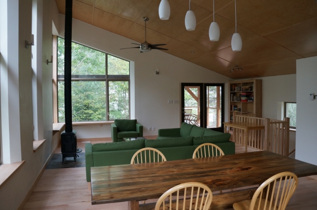
Image Credit: All images: Craig Anderson The lower floor of the house is for private spaces while the upper floor houses the kitchen, dining and living spaces. Even though the master bedroom gets limited daytime use, the views encouraged generously sized windows.
This is the last in a series of posts by Craig Anderson describing the off-the-grid house he built with his wife France-Pascale Ménard near Low, Québec. Craig writes about the “Seven Hills Project” in a blog called Sunshine Saved. For a list of Craig’s previous posts, see the list of “Blogs by Craig Anderson” in the sidebar below.
From the very beginning of our project, I had a lot of ideas about what I wanted to accomplish with the architectural style as well as the interior layout and design. While I think I would have ended up with mostly good choices by myself, the assistance of our architect Anthony Mach was invaluable.
Going into the early phases of the project, I thought I had a much clearer notion than many people would have, yet I often needed access to an expert opinion about what was doable and how to make all of the parts fit together. And don’t even get me started on the process of turning the rough sketches into final blueprints. I still don’t have anywhere near the knowledge I would have needed to put together those technical details.
Start with a list of what you want
For any of you considering building a custom home, I would recommend that you start by doing what we did, and make a list of things that you require, those that you would like, and those that you just don’t want to do. Also take the time to look at lots of pictures, as it always helped us to figure out if something would work by finding a good example. My digital scrapbook of inspiration eventually made it to several hundred pictures. And be prepared to revise that list in the face of budget, practicalities, or even your own changing understanding.
Our starting list as of the time that we first met with Anthony was the following:
- 1. Three bedrooms, two bathrooms.
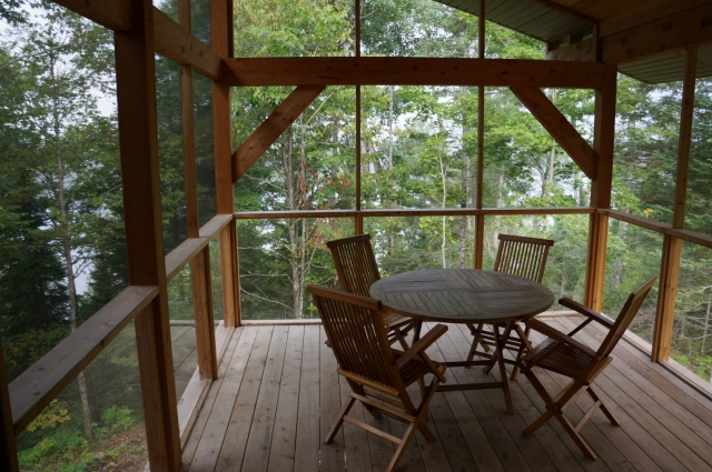
- 2. A nice screened porch facing the river.
- 3. Upside-down design, with living spaces on the upper level, and the bedrooms on the lower level.
- 4. Passive solar orientation with plenty of big windows.
- 5. As compact a design as possible, given what we are trying to fit in, both for energy efficiency as well as to contain costs.
- 6. Superinsulation.
- 7. Timber framed, or otherwise using lots of natural wood.
- 8. Contemporary design with a single, pitched shed-style roof.
- 9. Resilient design, using well-chosen design details and high-quality components so the house will age well over decades.
- 10. A big stone fireplace with a high-efficiency stove insert.
We already had a fairly well-developed plan by the time we went to Anthony, so I feel pretty good that out of this initial list, the only item that was dropped was the large stone fireplace. It turns out that doing a fireplace the old-fashioned way with large natural stone is very energy inefficient as well as incredibly expensive.
The vast majority of the “stonework” one sees on both the interior and exterior of today’s buildings is actually painted concrete. These stone facades are relatively thin pieces of veneer that can be added to almost any wall, and the process now yields fairly realistic-looking stone. With this entire project I’ve wanted things to feel as authentic as possible, and fake stone just wasn’t something that appealed to me.
As the plans developed further, we realized the simple clean lines of a wood stove and interior stove pipe were just as good of an aesthetic fit while being much better in terms of cost and energy efficiency.
Open concept living
Along with a lot of others who are buying and building houses today, we wanted an open concept design with a single great room containing the kitchen, dining, and living spaces. I have heard and read quite a number of things about the growing popularity of the open concept, and it seems that there are two major drivers.

The first is a greater desire for families to spend time together. With parents working more hours and kids involved in more activities, families want to spend the few hours where everyone is at home together.
The other trend is for increasingly casual living arrangements. People no longer want to hide the mess of the kitchen and eat in a formal dining room. This fits just about right with our own decision about building this way; this was always intended to be a place for the family to be together. Opening up the living and cooking spaces to each other solves all of these issues, putting everyone in one space.
We ended up with a room of 18 feet by 38 feet (684 square feet), which has been fantastic for family time and groups up to about 15 people. We often are cooking and doing cleanup at the same time as we entertain or keep an eye on our young children.
Screened porch
A screened porch also was at the very top of our list of desired features. In our climate, it may only be porch weather for four months of the year, but during that time it is the best place in the house.

Screened porches aren’t all that popular here in eastern Canada, and I actually have no idea why. In Minnesota, where I grew up, basically every cabin, and many homes, have screened porches. Granted, the mosquitoes are the size of sparrows there, but there isn’t exactly a shortage of biting insects here in the region around Ottawa.
The bug season makes enclosed spaces awfully appealing for outdoor living throughout the wet northern temperate climates. In a lot of the modern architecture photos and articles that I’ve looked at, I often see whole walls that open to make indoor/outdoor spaces, and decks and porches seldom seem to have any bug protection. This may work in California, but that sort of design certainly does not fit well in a place where the biting insect season almost completely overlaps the warm months.
Upside-down design
Most multi-story homes have the main living areas on the main floor, with bedrooms above. One can enter the house and go straight into the public spaces with the bedrooms tucked away up a staircase. This arrangement isn’t so great if your home has a view you want to enjoy, because those views generally improve the higher one goes. I don’t think a lot of people spend hours in their bedrooms admiring the views.
In our case, we had a perfect setup to flip the house upside-down. We planned from the beginning to have a walkout basement, and we had tremendous views that we wanted to appreciate. Pushing the house into the side of the hill also meant that it was only five steps up from the driveway to the upper level.
So, while I don’t think that’s for everyone, I wouldn’t do it any other way if we were building again at this site. The advantages are that we are able to really appreciate the views that our hilltop site affords, the space is much brighter, and it tends to be warmer upstairs, which is a boon most of the time (and conversely, the bedrooms stay cooler at all times of the year, which I appreciate when I sleep).
All that said, there is one significant drawback: Even with some insulation to deaden the footfalls, it can be difficult to stay asleep downstairs when there is a 3-year-old running wind sprints back and forth above your head at 6:00 in the morning.
Our downstairs is taken up by three bedrooms, one full bath, and a mechanical / storage space (see Image #2, below). We kept the bedrooms to a relatively modest size, each at about 12 feet square. This is big enough to have a full set of bedroom furniture but leaves relatively little room to spare. Some people now put in massive bedroom suites, but it seems to me that bedrooms are mostly just for sleeping and not for hanging out.
And just to show that I’m not entirely consistent, I’ve included a picture (see image #3, below) of the windows we put in the master bedroom. I couldn’t resist taking advantage of the view even if we don’t spend that much time in there appreciating it.
Contemporary style
There are dozens of popular styles for homes: Prairie, Tudor, Craftsman, and many others. Though there are some cultural and climatic reasons for choosing one style over another, the better part of the decision comes down to aesthetics. Through all phases of the design process, I spent a good deal of time looking at architectural and design websites, articles, magazines, and photos. I was particularly drawn to aspects of the contemporary style; making the decision really came down to that appeal.
As I really dug into the sorts of places I found inspirational, I found even more tightly defined terms like “modern rustic” or “mountain contemporary.” These styles really have become quite popular with those who build nice houses out in the woods, fields, and mountains. Staying within a given style lends a sense of continuity to a home, from the inside to the outside, and from room to room, though there are certainly some eclectic homes that stand the test of time as well.
If you search around for terms like these in architectural magazines and websites, you’ll find no shortage of examples that have a similar feel to our own place, relatively modern looking with lots of natural wood, stone, and big windows to take in the views. I just hope that in 20 or 30 years, our choices don’t look as dated as all of the ’70s lime green, orange, and dark faux wood paneling my parents installed when they built their own cottage back in the day.
A few of the architects and builders who had the most influence on our aesthetic choices are the following:
- Finne Architects. Extremely high-end custom contemporary homes. They are absolutely beautiful, but I don’t even want to know what the costs are. Nils Finne and his team make a large amount of built-ins, custom furniture, and unique designs for each and every project.
- Method Homes. A prefabricated home builder. Some of their home styles are quite architecturally similar to our own final design.
- GO Logic, particularly this Passive House they built.
-
Use of large dimension timbers
My wife and I both love natural wood finishes, and I am exceptionally fond of the bigger timbers used in timber framing. However, in the earlier part of our own design process, I learned why there are so few timber frames being built today.
First, building with big timbers is expensive. The wood costs are significantly more, but so are the costs of cutting the traditional joinery (needed before the easy availability of strong metal nails and screws).
Second, it is quite difficult to insulate a timber-frame building. The most common way of doing so is to build the house twice: First build the timber frame, then build another full wall and roof assembly outside of that which can be insulated normally.
At the same time, the timbers are beautiful. Many people generate a similar look with false beams or wrapping regular construction lumber in naturally finished boards. But like faux stone, these attempts can end up looking inauthentic or cheap.
With all this in mind, we found a few places in our home where big dimensional timbers made a bit more sense, using a “hybrid” timber frame. The first location was our screened porch. Here, there aren’t any issues of insulation to deal with, as the whole structure is just a shell to keep out insects, with cedar floors, plexiglass lower panels to prevent anyone from falling through, and screen above.
Second, we used big beams to hold the roof trusses on the big overhangs. We put 4-foot overhangs around the entire home, and though there are multiple ways to support this sort of detail, we did so with large Douglas fir beams on which all of the roof trusses rest.

A “hybrid” timber frame allowed the use of oversize wood components in selected areas without the expense or technical challenges of a true timber-frame building. Finally, we used white pine beams for the floor joists and supporting beam for the second story. We were going to need to put in joists anyway, so we decided to use 4×8 joists, and a 10×12 supporting beam. This provides a beautiful ceiling for the entire downstairs level, and should be rock-solid for the lifetime of the house.
The heavy beams we included all serve very functional purposes. It was important to me the beams not simply be decorative. For all of our timber work, we used simpler joints held together by screws rather than traditional mortise-and-tenon joinery, which allowed all of the installation to go much more quickly.
Building for resilience
Finally, I want to make some comments about building for the long term. So many decisions in home building (and too many other domains as well) are made only for the short term. For builders, it usually makes the most sense to build the most inexpensive construction that they can get away with, and then invest more on those parts of a home that really catch the eye of the buyers, like the fancy kitchen, spa type bathroom, or big walk-in closets.
People don’t tend to be very good at evaluating what is behind the final finishes, nor are they good at imagining what the future maintenance, replacement, utility bills, or other costs will be. Further, people only own a given home for an average of 13 years, so any feature that doesn’t do well on the resale market is less likely to make it into the average home.
This is of course not a complete picture. The building code improves steadily, requiring constantly better insulation, air-sealing, air quality features, and more. And there is a growing trend toward green building, emphasizing reduced energy use and healthier indoor air. Unfortunately, these are still relatively niche markets, and the average new home being built is far less than it could be.
For our own project, we built a place that we hope to never have to sell during a lifetime, and if things go really well, our kids will continue to use it even after we are gone. With those kind of goals in mind, it is much easier to think about a 50-year time frame, and to be able to justify the costs of doing things right the first time around.
If we’ve succeeded at this, we may have very little maintenance and renovation work to do on the house itself for decades to come. Only time will tell us if we succeeded. So rather than discuss all of the details individually, I just include a long list of the details that we included for the sake of long-lasting quality.
- Steel through-fastened roof. Should last in excess of 50 years.
- Four-foot overhangs on all sides of the building. Reduces the exposure of the siding and base of the house to sun, rain, and snow, which should extend the lifetime of the siding.
- Great drainage and waterproofing around the house. Should keep all water away from the foundation indefinitely.
- Poured concrete foundation rather than cement block. Much longer lasting, and much more resistant to the elements.
- Low maintenance landscaping and plantings, which should require little to no watering or fertilizer.
- Cement board siding. Though after learning more, I would likely go with steel siding for the entire building. Steel has the same pros of fire and pest resistance, but has lower embodied energy, lasts longer and is more easily recycled.
- Real wood (white pine and sugar maple) for the trim, flooring, staircase, and wooden interior doors. These should last much longer than hollow or fiberboard materials and can easily be refurbished rather than replaced if they receive any abuse.
- Low- and no-volatile organic compounds (VOCs) in all paints and finishes. These allow for much improved air quality, and I expect to see indoor air quality standards to become much more strict than they are today.
- High levels of insulation, mostly with Roxul mineral wool.
Weekly Newsletter
Get building science and energy efficiency advice, plus special offers, in your inbox.


One Comment
Craig
You have ended up with a really delightful, well thought out house I've enjoyed reading about. Thanks.
Log in or create an account to post a comment.
Sign up Log in